• This is a political forum that is non-biased/non-partisan and treats every person's position on topics equally. This debate forum is not aligned to any political party. In today's politics, many ideas are split between and even within all the political parties. Often we find ourselves agreeing on one platform but some topics break our mold. We are here to discuss them in a civil political debate. If this is your first visit to our political forums, be sure to check out the RULES. Registering for debate politics is necessary before posting. Register today to participate - it's free!

Some IPCC Problems

Actually, what you're looking at is a graph that shows that earth's temperature is cyclical.

Well, duh

There's nothing about believing in global warming that suggests that global temp is not cyclical.


The "trend" you're seeing is for a brief period in time that is no different than for similar periods in time in the past. In other words, it shows that what we're experiencing, we've experienced numerous times before, and will continue to experience in the future. There is precisely NOTHING that suggests in that graph the remotest need for alarm. It's typical; it's normal. Moreover, it shows that for the past thousand years or so our temperature has been TRENDING downward.

No, it shows that it recent years, the trend has been upwards at a rate faster than at any other time on the graph
 
Well, duh

There's nothing about believing in global warming that suggests that global temp is not cyclical.

No, it shows that it recent years, the trend has been upwards at a rate faster than at any other time on the graph
Actually, it's impossible to see any such thing, but then we've already determined those who interpret the data in favor of AGW haven't a clue what they're looking at anyway.
 
Well, duh
There's nothing about believing in global warming that suggests that global temp is not cyclical.

No, it shows that it recent years, the trend has been upwards at a rate faster than at any other time on the graph
Well I'd love to see you quantify the changes in rate on that graph. I did a little doodling of my own from which perhaps you can show us:

Specifically, how that AVERAGE rate of change is "faster" than for any other period of time on the graph:
4000yearsgreenland_nov2011_gprl-1.JPG

Specifically, how that SHORT TERM rate of change is "faster" than for any other periods of time on the graph:
4000yearsgreenland_nov2011_gprl-3.JPG

...because personally, I think you're way off base in your assertion.

Here's the original again:
4000yearsgreenland_nov2011_gprl.jpg
 
It's simple. Global temperature is cyclical, even sinusoidal, like the movement of that little girl. Where one is at any given point on the curve will determine for some, as for that little girl, whether they scream or not.

For others, we just recognize it's a ride.

View attachment 67154575

So you make no effort to analyze the reasons for these cycles, what influences them, and what alters them? Ok!
 
So you make no effort to analyze the reasons for these cycles, what influences them, and what alters them? Ok!
What in the world are you attempting to prove now?

We've already demonstrated you've no point; we've proven the "data" concludes to precisely squat in your favor. And now you make this asinine statement. I think it's time you just admitted failure and move on.
 
So you make no effort to analyze the reasons for these cycles, what influences them, and what alters them? Ok!

And of course you have done ? Dont let me stop you explaining the cause of each natural peak and trough in that 4000 year graph then ! :lamo
 
Actually, what you're looking at is a graph that shows that earth's temperature is cyclical. The "trend" you're seeing is for a brief period in time that is no different than for similar periods in time in the past. In other words, it shows that what we're experiencing, we've experienced numerous times before, and will continue to experience in the future. There is precisely NOTHING that suggests in that graph the remotest need for alarm. It's typical; it's normal. Moreover, it shows that for the past thousand years or so our temperature has been TRENDING downward.

The myopic tendency to view "trends" that are but snapshots in time is what is the real problem here. It is a very basic error many make who do not understand cyclical processes - viewing the slope of a tangent line at a peculiar moment in time and making the absurd assumption that that slope "means" something contrary to the data taken as a whole.

Thats very convincing. Using a proxy like that really shows good science, wouldnt you agree?

I wonder what would happen if we found other proxies.. like dozens of them. And not from one specific ice core in one specific place, but if we could get them distributed worldwide... so we could get a better handle on the entire temperature record of the entire globe... not just a single area. Wouldnt that be breakthrough science!

Oh wait. Its been done. Dozens of times.

hagymeze.jpg
 
Well I'd love to see you quantify the changes in rate on that graph. I did a little doodling of my own from which perhaps you can show us:

Specifically, how that AVERAGE rate of change is "faster" than for any other period of time on the graph:
View attachment 67154663

Specifically, how that SHORT TERM rate of change is "faster" than for any other periods of time on the graph:
View attachment 67154664

...because personally, I think you're way off base in your assertion.

Here's the original again:
View attachment 67154665

Thats very convincing. Using a proxy like that really shows good science, wouldnt you agree?

I wonder what would happen if we found other proxies.. like dozens of them. And not from one specific ice core in one specific place, but if we could get them distributed worldwide... so we could get a better handle on the entire temperature record of the entire globe... not just a single area. Wouldnt that be breakthrough science!

Oh wait. Its been done. Dozens of times.

hagymeze.jpg
:lamo :lamo

Do you know what an "anomaly" is? It's an unexpected deviation in the data; keyword - "unexpected." And FYI, that's what your graph is showing - unexpected deviations in the data.

Now, and please pay attention because this is important - couple your graph with a graph that shows ACTUAL temperatures and what do you get? Well I'll tell you - it demonstrates that because ACTUAL temperatures aren't responding according to scientist's models, that they aren't responding according to scientist's EXPECTATIONS that scientist's expectations are WRONG! That's what your graph, coupled with actual data proves (thank you btw).

We can take it a step further too: given your graph, coupled with actual temperature data proves conclusively that scientist's expectations are wrong, we can then infer something important about their incorrect expectations too. THEIR PREMISES - especially w/r to AGW - are FALSE too.
 
Thats very convincing. Using a proxy like that really shows good science, wouldnt you agree?

I wonder what would happen if we found other proxies.. like dozens of them. And not from one specific ice core in one specific place, but if we could get them distributed worldwide... so we could get a better handle on the entire temperature record of the entire globe... not just a single area. Wouldnt that be breakthrough science!

Oh wait. Its been done. Dozens of times.

hagymeze.jpg
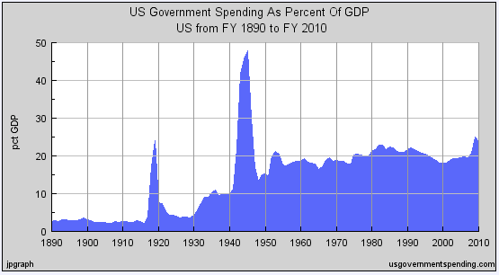
Frankly, I wish the same people who get all excited and hot and bothered about vertical lines on graphs such as that would get as excited and hot and bothered about graphs such as this one:
Spending.jpg

...but I suspect that'd be asking too much.
 
Frankly, I wish the same people who get all excited and hot and bothered about vertical lines on graphs such as that would get as excited and hot and bothered about graphs such as this one:
View attachment 67154738

...but I suspect that'd be asking too much.

I see some people have no conception of inflation, logarithmic graphs, or basic science.
 
:lamo :lamo

Do you know what an "anomaly" is? It's an unexpected deviation in the data; keyword - "unexpected." And FYI, that's what your graph is showing - unexpected deviations in the data.

Now, and please pay attention because this is important - couple your graph with a graph that shows ACTUAL temperatures and what do you get? Well I'll tell you - it demonstrates that because ACTUAL temperatures aren't responding according to scientist's models, that they aren't responding according to scientist's EXPECTATIONS that scientist's expectations are WRONG! That's what your graph, coupled with actual data proves (thank you btw).

We can take it a step further too: given your graph, coupled with actual temperature data proves conclusively that scientist's expectations are wrong, we can then infer something important about their incorrect expectations too. THEIR PREMISES - especially w/r to AGW - are FALSE too.

Actually, whats happening is that recent tree rings are not correlating with temperature as they had in the past in Northern temperate climates - not all over the world. There are lots of theories for why that divergence exists, but NOT ONE SCIENTIST (outside of the nutters on the blogs you frequent) thinks this is a reason to dismiss the data.

Heres a recent review. I'm sure you'll discard it as you disregard most scientific data that doesnt fit your preformed conclusions. Note that this exhaustive review referencing virtually every paper ever looking at the issue doesnt even mention your point that models are wrong. Because its not true.


You know, these guys put a massive amount of time, brainpower and effort in figuring this stuff out. Respect it, and dont just make **** up because you dont like the answers.

http://www.wsl.ch/info/mitarbeitende/cherubin/download/D_ArrigoetalGlobPlanCh2008.pdf
 
I see some people have no conception of inflation, logarithmic graphs, or basic science.
I see some people can't tell the difference between a linear graph and a logarithmic graph. Not surprising, I suppose - given other "interpretations."

Moreover, confusing the former with the latter (as you've done here), it's also evident some people are unable to spot exponential rates of increase... even when they see a picture of one.

Since you DON'T know the difference in any of the above, I'll give you a hint: you can always tell the difference between a linear graph and a logarithmic one by the scales. Further hint: this one's linear. :thumbs:
 
Actually, whats happening is that recent tree rings are not correlating with temperature as they had in the past in Northern temperate climates - not all over the world. There are lots of theories for why that divergence exists, but NOT ONE SCIENTIST (outside of the nutters on the blogs you frequent) thinks this is a reason to dismiss the data.

Heres a recent review. I'm sure you'll discard it as you disregard most scientific data that doesnt fit your preformed conclusions. Note that this exhaustive review referencing virtually every paper ever looking at the issue doesnt even mention your point that models are wrong. Because its not true.


You know, these guys put a massive amount of time, brainpower and effort in figuring this stuff out. Respect it, and dont just make **** up because you dont like the answers.

http://www.wsl.ch/info/mitarbeitende/cherubin/download/D_ArrigoetalGlobPlanCh2008.pdf
Pot, meet kettle.
 
You know, these guys put a massive amount of time, brainpower and effort in figuring this stuff out.

http://www.wsl.ch/info/mitarbeitende/cherubin/download/D_ArrigoetalGlobPlanCh2008.pdf

True enough. Problem is they're incompetent statisticians.

A statistical analysis of multiple temperature proxies: … - ‎McShane


  1. McShane and Wyner 2010 « Climate Audit

    climateaudit.org/2010/08/14/mcshane-and-wyner-2010/‎
    Aug 14, 2010 - A reader (h/t ACT) draws attention to an important study on proxy reconstructions (McShane and Wyner 2010) in the Annals of Applied Statistics:peace ...
 
Three minutes between my post and your response.

Not surprised you didnt read the article.
Three minutes was all the time I needed to write my response to posts that demonstrated you hadn't given a second of thought to yourself - which wasn't surprising either.
 
True enough. Problem is they're incompetent statisticians.

A statistical analysis of multiple temperature proxies: … - ‎McShane


  1. McShane and Wyner 2010 « Climate Audit

    climateaudit.org/2010/08/14/mcshane-and-wyner-2010/‎
    Aug 14, 2010 - A reader (h/t ACT) draws attention to an important study on proxy reconstructions (McShane and Wyner 2010) in the Annals of Applied Statistics:peace ...

Thanks for the non sequiter post, as usual, Jack.

This paper, of course, has been found a bit.... wanting.

RealClimate: Responses to McShane and Wyner
 
Three minutes was all the time I needed to write my response to posts that demonstrated you hadn't given a second of thought to yourself - which wasn't surprising either.

Thats pretty nonsensical.

Well, if you read it, you'd understand that the tree ring proxies from the 60s on are not in line with historical tree ring studies that correlate with actual temps- of which go back another 150 years. And tree rings were only a small bit of the proxies used in the temperature reconstructions that I posted.
 
Thanks for the non sequiter post, as usual, Jack.

This paper, of course, has been found a bit.... wanting.

RealClimate: Responses to McShane and Wyner

Well, no. All the RC agit-prop specialists did was inadvertently reinforce the assertion of McShane & Wyner that climate scientists don't know what they're doing with statistics. McShane & Wyner, btw, are professional statisticians from those hotbeds of denial, Northwestern and Penn, respectively.:peace
 
Frankly, I wish the same people who get all excited and hot and bothered about vertical lines on graphs such as that would get as excited and hot and bothered about graphs such as this one:
View attachment 67154738

...but I suspect that'd be asking too much.

Because like Centigrade scale, the value of a dollar is a constant value and just as there's no need for more heat as the population increases, there's no need to spend more to protect and govern a larger population :roll:

and-heres-another-look-at-federal-spending-as-a-percent-of-gdp-for-the-past-century-its-not-way-out-of-whack-these-days-at-least-relative-to-the-last-60-years-but-thanks-to-the-stimulus-its-higher-than-it-has-been-since-world-war-2-and-the-republicans-are-probably-right-its-too-high.jpg
 
What in the world are you attempting to prove now?

We've already demonstrated you've no point; we've proven the "data" concludes to precisely squat in your favor. And now you make this asinine statement. I think it's time you just admitted failure and move on.

I'll be super clear then:

The fact that climate changes on its own does not preclude human influence on climate. Merely looking at a temperature chart does not describe to you why that particular change occurred.

The "usual factors" do not account for all of the temperature trend we've been experiencing over the last century or so. This one is a bit different.
 
Because like Centigrade scale, the value of a dollar is a constant value and just as there's no need for more heat as the population increases, there's no need to spend more to protect and govern a larger population :roll:
Well all I can say is thanks, I've been looking for a suitable quote to put in my siggy. :roll:

Ok, just for fun, I'm going to remove the IMG tags and the http:// from your attachment so we can see the name of the file you attached:

static3.businessinsider.com/image/4e1c5ade4bd7c86b22030000-1200/and-heres-another-look-at-federal-spending-as-a-percent-of-gdp-for-the-past-century-its-not-way-out-of-whack-these-days-at-least-relative-to-the-last-60-years-but-thanks-to-the-stimulus-its-higher-than-it-has-been-since-world-war-2-and-the-republicans-are-probably-right-its-too-high.jpg
 
Back
Top Bottom