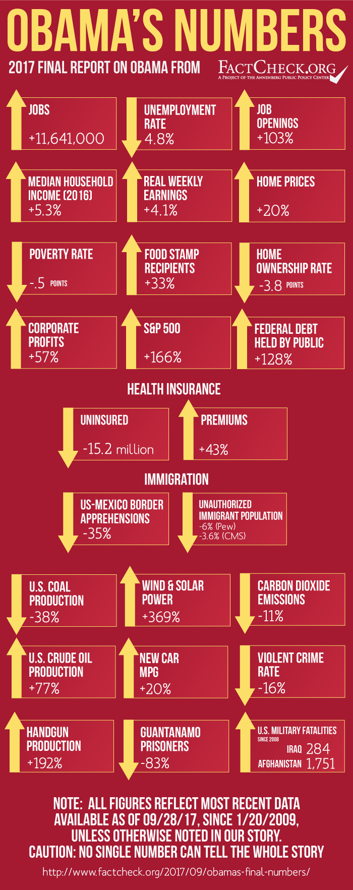
Your numbers are a lot easier to understand in graphic form
View attachment 67231344
(Oops, forgot the actual page link to
All employees, thousands, total nonfarm, seasonally adjustedthe actual page link as a separate entry.)
That graph looks sort of "flatish" from 2011 onward to me but I am sure that you will point out the massive upsurge that the BLS is deliberately hiding so as to make Mr. Trump look bad.
The total for 2016 is 2204 units. The total for 2017 is 2188 units. 2188 is 99.2740% of 2204. The difference in "job creation" between the last year of Mr. Obama's term and the first year of Mr. Trump's term is 0.7260% (and NOT in favour of Mr. Trump).
You might also find the BLS data on
Employed full time (persons who usually work 35 hours or more) interesting.
View attachment 67231345
You might not notice it unless someone points it out to you, so I will point it out to you, but that graph looks remarkably like a statistical straight line from 2011 onward.
However, I have no doubt that you will show everyone how the BLS has deliberately published false data for seven years to conceal the fact that the entire 15,000(ish) units were all added after January 2017.