- Joined
- Mar 7, 2018
- Messages
- 68,960
- Reaction score
- 22,530
- Location
- Lower Mainland of BC
- Gender
- Male
- Political Leaning
- Centrist
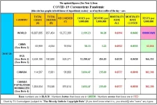
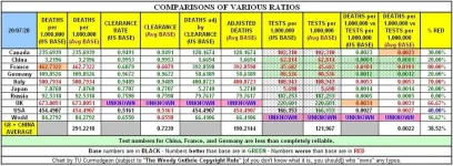
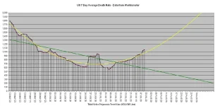
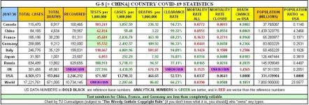
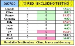
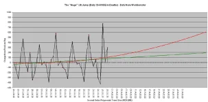
TODAY'S CHARTS
(based on Worldometer data as of 0001 Z MON 27 JUL 20)


EXPLANATORY NOTES FOR GRADUATES OF “PIOOYA STATISTICS” CLASSES TAUGHT BY INNUMERATE DOLTS
(who probably have a BA [Pla-Doh], a BS [Statistics], and a PhD [Finger Painting] from the University of Numerology)
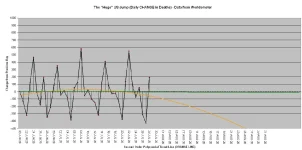
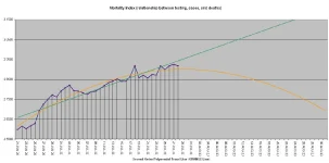
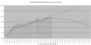
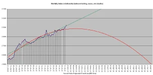
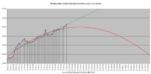
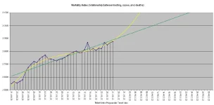
- The "Mortality Index" chart tracks the relationship between mortality and testing. If mortality is flat and testing goes up, the index will go down. If mortality is flat and testing goes down, the index will go up. If mortality increases and testing goes up proportionately, the index will be flat. If mortality increases and testing increases by a greater proportion, the index will go down. If mortality increases and testing increases by a lesser proportion, the index will go up. If mortality - oh heck, you get the idea. An increase in the index is a "Bad Thing" and a decrease in the index is a "Good Thing".
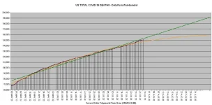
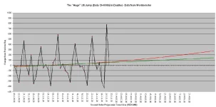
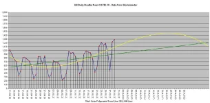
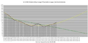
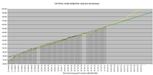
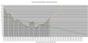
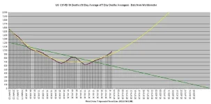
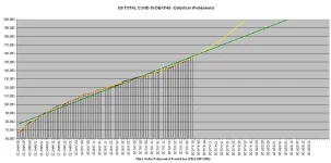
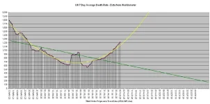
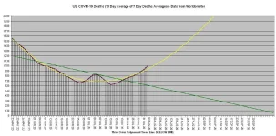
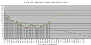
* - The YELLOW trend lines are "third order polynomial" trend lines and those tend to be "livelier" than "linear" trend lines. Thank you “Jay59” for the upgrading suggestion.
* - The ORANGE trend lines are second order (“cubic) polynomial trend lines (and those tend to be REALLY "frisky").
* - The smaller the number of data points, the less reliable the trend lines are.
* - Further suggestions to improve the accuracy of the PROJECTIONS are welcomed. “I don’t like the data or what generally accepted mathematical formulae say about the data – so you are full of crap.” comments will be ignored.
* - The GREEN trend lines are “linear” trend line and those tend to be unresponsive to the latest developments.
* - The ACTUAL TREND is likely to be someplace between that indicated by the GREEN trend line and the YELLOW (or ORANGE) trend line.
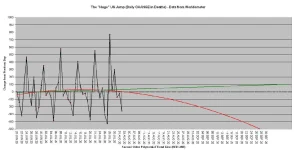
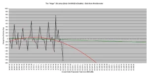
* - Reported deaths normally take dips on weekends (which means the Sunday and Monday numbers are lower than the actual numbers of deaths and the Tuesday and Wednesday numbers are higher),
* - Reported deaths normally take dips around “emotionally significant dates” (sometimes known as “The ‘Christmas’ Effect” or “The ‘Birthday’ Effect”).
* - The trend lines are based on actual current and past data and are footed on the assumption that the conditions current as the generation of the chart do not change.
* - IF those conditions do change THEN the trend lines WILL change. This, unlike what some dolt will tell you, does NOT mean that the trend lines were wrong when calculated.
* - Simply pulling numbers out of your butt, the way that some dolts do, and then using those PIOOYA numbers to claim expertise just doesn’t hack it in the real world (well, outside of 1600 Pennsylvania Avenue, Washington DC it doesn’t).


