Prove that new data undid the data I presented. Show us. You can't, so you won't.
Okay....now I see where your confusion lies....I noticed it a few minutes ago in your graph(s)
What you are providing demonstration of is the numbers of diagnosed positive cases. What I am referring to, which is the
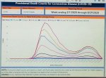
REAL indicator of how we are doing with respect to the coronavirus, is the death counts. The CDC provides weekly death
counts, and that graph is in the link below (apologies, but I could not save the graph as an image to just post here).
COVID-19 Provisional Counts - Weekly Updates by Select Demographic and Geographic Characteristics
Now.....what you are looking at is dependent (in large part) on the numbers being tested.
Pretend you test 1000 people this week, and 10,000 people next week, and the numbers of positive cases jumps way up. Is it
that you actually had more cases, or that you tested more, thus are AWARE of more cases?
It certainly seems to me that the latter is the case here.
If you will look at the history of covid testing numbers actually done, you will see that in the early stages, when testing
really became a "big deal", the numbers of tests (and the numbers of positives) were relatively low, and as testing numbers
increase, the numbers of positives did as well.
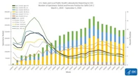
According to the CDC, the percentage of positives out of those tested has been declining since mid-July.
As an example of my point:
March 13, there were 3735 tests performed.
July 23, there were 1,551,253 tests performed.
But if you will see the graph below, you will see that the percentages of positives has declined.
Of COURSE it's going to look like our Covid status just kept getting worse and worse. The reason it looked that was was
because testing had increased exponentially, thus the positives did as well. There were not necessarily more positives as
much as there was greater AWARENESS of those positives.
US Historical Data | The COVID Tracking Project
COVIDView: A Weekly Surveillance Summary of U.S. COVID-19 Activity | CDC


/cdn.vox-cdn.com/uploads/chorus_asset/file/21824145/coronavirus_data_explorer__1_.png)


