- Joined
- Jun 14, 2019
- Messages
- 1,333
- Reaction score
- 732
- Gender
- Female
- Political Leaning
- Very Liberal
Since different states used different standards when deciding when to attribute deaths to COVID, using their self-reported numbers can be misleading. But where we can do a clear comparison is in terms of how much mortality was elevated in each place, during the pandemic. If, for example, in the five years before COVID an average of 1% of the population died per year, and then during COVID it was an average of 1.25%, that's a 25% elevation of mortality.
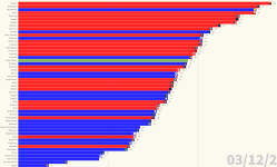
Using that method, I put together a visualizer that allows you to watch two years of COVID play out over 45 seconds, with the cumulative percentage of excess mortality for each state.
You can see that early on states like NJ, NY, and CT got hit hardest. Over time, though, other states wound up moving ahead. Eventually, looking at a two-year period from the start of April 2020 to the end of March 2022, AZ, MS, and TX wound up having the worst cumulative performance:
https://public.flourish.studio/visualisation/9658616/
<div class="flourish-embed flourish-bar-chart-race" data-src="visualisation/9658616"><script src="https://public.flourish.studio/resources/embed.js"></script></div>
It's most interesting when you go to the site and watch the full animated "race," so you can see different states rise and fall over time (as policy gradually and cumulatively trumped dumb luck), but here's a screen shot from the end, to give you a feel for it:


