- Joined
- Jan 28, 2013
- Messages
- 94,823
- Reaction score
- 28,342
- Location
- Williamsburg, Virginia
- Gender
- Male
- Political Leaning
- Independent

But solar activity had been falling for the past few decades, which, according to Svensmark, should mean more cosmic rays and more low clouds. So this graph would appear to contradict Svensmark's theory, wouldn't it?

But solar activity had been falling for the past few decades, which, according to Svensmark, should mean more cosmic rays and more low clouds. So this graph would appear to contradict Svensmark's theory, wouldn't it?

But solar activity had been falling for the past few decades, which, according to Svensmark, should mean more cosmic rays and more low clouds. So this graph would appear to contradict Svensmark's theory, wouldn't it?
Until the recent turn toward minimum, the sun has been quite active recently.
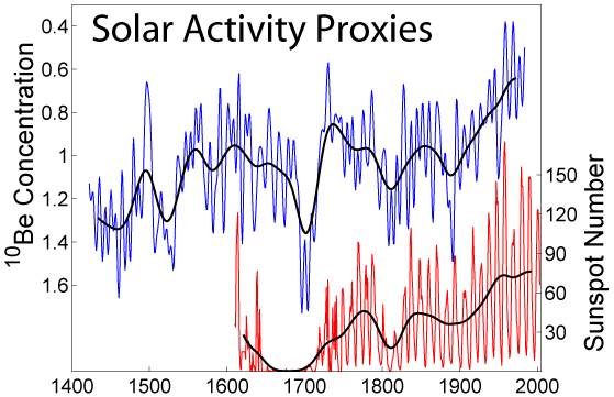
Your graphs are not very informative because they have completely different timescales. We know, of course, that the sun's activity varies in 11-year cycles, so this graph simply shows the last cycle. What it doesn't show is that the 2014 maximum was very low compared with previous maxima and that, if you average over cycles, the sun's activity has been falling for the last few decades. So, according to Svensmark, cloud cover should be increasing, not falling, over this timescale.
If you are trying to show some correlation between cloud cover and solar output/activity, then it would be a good idea to plot them on the same graph using the same timescale!
Keep quibbling.
It's rather amusing that the failure of reality to match Svensmark's theory is a mere quibble as far as you're concerned. Which do you suppose is wrong? Svensmark, or reality? Or does it simply not matter to you?
It's rather amusing that the failure of reality to match Svensmark's theory is a mere quibble as far as you're concerned. Which do you suppose is wrong? Svensmark, or reality? Or does it simply not matter to you?
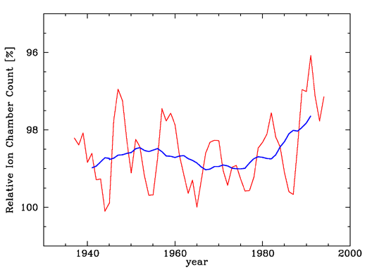
According to the graph in your post #1001, cloud cover diminished in the period from 1983 to 2009. But according to this graph, solar output fell over the same period. This contradicts Svenmark's theory, which predicts that cloud cover should increase, not diminish, as solar output falls. So Svensmark's theory must be wrong, musn't it?
I'm afraid you are misreading the graph.
I don't think I am. The graph you posted on #1001 clearly shows cloud cover falling from 1983 to 2009, does it not? And the end of the thick blue line in your graph from #1003, corresponding to the 11-year mean TSI from 1983 to 2009, is clearly falling. How does this not contradict Svensmark's theory?
Actually, #1001 shows cloud cover increasing in 2009, while in #1003 TSI takes a small dip in 2009 after a period of rising and holding steady. Thank you for illustrating the strength of Svensmark's thesis.
:lamo Now that is what I call desperation!
Merely reading the graph. Your error is clear.
Picking out one tiny section of a graph that agrees with your thesis while ignoring all the sections that don't agree with it is not reading a graph! That's why we use trend lines to determine agreement. Did you learn nothing in science class? :lamo
You're the one who emphasized "the end of the thick blue line" while ignoring what went before the end. Your claim in #1018 is unusually stupid and hypocritical. You should slink away in embarrassment.
Look at the timescales on the graphs, and you will see that the end of the thick blue line in the TSI graph corresponds to the entire length of the cloud cover graph.
No. It does not.

Your graphs are not very informative because they have completely different timescales. We know, of course, that the sun's activity varies in 11-year cycles, so this graph simply shows the last cycle. What it doesn't show is that the 2014 maximum was very low compared with previous maxima and that, if you average over cycles, the sun's activity has been falling for the last few decades. So, according to Svensmark, cloud cover should be increasing, not falling, over this timescale.
If you are trying to show some correlation between cloud cover and solar output/activity, then it would be a good idea to plot them on the same graph using the same timescale!
It's rather amusing that the failure of reality to match Svensmark's theory is a mere quibble as far as you're concerned. Which do you suppose is wrong? Svensmark, or reality? Or does it simply not matter to you?
I clearly owe you an apology, Jack. As someone with a scientific education who works regularly with numbers, I sometimes forget that those whose talents are oriented more towards the liberal arts may sometimes have difficulty interpreting numerical data and graphs, and I fear I have been expecting too much of you in this regard. In future, I will attempt to keep my explanations to a more basic level that can be understood even by those who may struggle with mathematical and graphical concepts. So let's try again.
If you look closely, you'll see that the numbers that run along the bottom of the first graph begin with Dec-1983 and end with Dec-2011. However, the green curve, representing tropical cloud cover, ends at December 2009. The graph of tropical cloud cover therefore covers a period of 2009 minus 1983 = 26 years.
Now look at the numbers along the bottom of the second graph. They begin with 1600 and end with 2000. However, we see that the blue 11-year running mean TSI graph starts at about 1610 and runs to about 2010 - a period of 400 years.
This means that the second graph covers a period of time that is 400 / 26 = 15.4 times as long as that covered by the first graph. Hence, if we wish to compare the two graphs, we can only use the 1/15.4 of the second graph that corresponds to the same time period as the first graph. I hope you can see now why it is so important to pay attention to the numbers on the graph axes and why, in this case, the last 15th or so of the TSI graph corresponds to the entire cloud cover graph.
