• This is a political forum that is non-biased/non-partisan and treats every person's position on topics equally. This debate forum is not aligned to any political party. In today's politics, many ideas are split between and even within all the political parties. Often we find ourselves agreeing on one platform but some topics break our mold. We are here to discuss them in a civil political debate. If this is your first visit to our political forums, be sure to check out the RULES. Registering for debate politics is necessary before posting. Register today to participate - it's free!

Stats According to States

PoliSciPulse

DP Veteran
Joined
Nov 5, 2020
Messages
3,510
Reaction score
1,457
Gender
Male
Political Leaning
Slightly Liberal
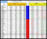
I respectfully submit this as evidence of coronavirus stats: https://docs.google.com/spreadsheets/d/19l7aXMqM33Z_NOfLgxfnCzpAAzu6uBNXYFERskusZcA/edit#gid=0
These are the official COVID stats provided by state departments (usually the health department of a given state) as a basis. Columns labeled "1% Bias" are 1% of whatever. So, when the media says "Deaths are up 1%," that's what 1% actually is. 4% underreporting bias is increasing the official stats by 4%. My friend saw this number, so I grabbed it and put it in.

When add a new edition, it will be commented to show which states are taking the national percentage of hospitalizations vs. actual numbers because the state department in whatever state is not reporting the hospitalization rate. I can provide those states now if you would like. So if the average hospitalization rate is 7%, the state would should 7% of that state being hospitalized. We also have fatality rate as compared to those hospitalized. Trump approval rating was achieved by googling it and finding the most recent article I could find, same with governor. +/- is compared to 50 percent (so 49% approval is -1 on the sheet) because it's easier for me to understand it that way the way my brain works.

COVID approval numbers and columns for vaccines and safe to reopen schools came from here: https://covidstates.org

Stats that are not as obvious on state websites were added from covidtracking.org. Sometimes they were one or two updates behind.

I manually entered this on the spreadsheet, which copied from the master spreadsheet I have running as I update it piecemeal. So, Alaska may not have been updated on the same day as Wyoming, but usually within the same week. This is raw data, so I'm not drawing conclusions from it or trying to prove anything. In fact, I was surprised by some of the results, and that's half the fun!

Most other columns should be fairly obvious about what they are doing, but if you need to know what it's doing, just ask!
 
Last edited:
I respectfully submit this as evidence of coronavirus stats: https://docs.google.com/spreadsheets/d/19l7aXMqM33Z_NOfLgxfnCzpAAzu6uBNXYFERskusZcA/edit#gid=0
These are the official COVID stats provided by state departments (usually the health department of a given state) as a basis. Columns labeled "1% Bias" are 1% of whatever. So, when the media says "Deaths are up 1%," that's what 1% actually is. 4% underreporting bias is increasing the official stats by 4%. My friend saw this number, so I grabbed it and put it in.

When add a new edition, it will be commented to show which states are taking the national percentage of hospitalizations vs. actual numbers because the state department in whatever state is not reporting the hospitalization rate. I can provide those states now if you would like. So if the average hospitalization rate is 7%, the state would should 7% of that state being hospitalized. We also have fatality rate as compared to those hospitalized. Trump approval rating was achieved by googling it and finding the most recent article I could find, same with governor. +/- is compared to 50 percent (so 49% approval is -1 on the sheet) because it's easier for me to understand it that way the way my brain works.

COVID approval numbers and columns for vaccines and safe to reopen schools came from here: https://covidstates.org

Stats that are not as obvious on state websites were added from covidtracking.org. Sometimes they were one or two updates behind.

I manually entered this on the spreadsheet, which copied from the master spreadsheet I have running as I update it piecemeal. So, Alaska may not have been updated on the same day as Wyoming, but usually within the same week. This is raw data, so I'm not drawing conclusions from it or trying to prove anything. In fact, I was surprised by some of the results, and that's half the fun!

Most other columns should be fairly obvious about what they are doing, but if you need to know what it's doing, just ask!

Hi!

From one spread-sheeter to another, greetings!

I've tracked the progress of the disease through the three basic numbers for the US as a whole -- total cases, total deaths and total recoveries -- provided by the Worldometer(r) site. I pick up the numbers at roughly the same time each day and use them, along with derived values, to follow trends. An individual day's result may be startling, but 7-day moving averages tame outliers.

At this point in time, the increase in reported new cases and reported deaths is of concern. The 7-day moving average of new cases has increased for 17 days in a row as of this writing.

Regards, stay safe 'n well. Remember the virus prophylactic Big 3: masks, hand washing and physical distancing.

Reminder. If you quote one of my posts and I do not respond, you may have managed to make it onto my 'Ignore' list.
 
Cool! Now you have the state breakdown to add to yours. Depending on how on top of it you are, your total will not add up to mine though.

In re masks: For some reason, when I wear them, they fall off my nose (though they do cover my mouth) and constantly have to re-adjust. Any idea how to fix that?
 
I respectfully submit this as evidence of coronavirus stats: https://docs.google.com/spreadsheets/d/19l7aXMqM33Z_NOfLgxfnCzpAAzu6uBNXYFERskusZcA/edit#gid=0
These are the official COVID stats provided by state departments (usually the health department of a given state) as a basis. Columns labeled "1% Bias" are 1% of whatever. So, when the media says "Deaths are up 1%," that's what 1% actually is. 4% underreporting bias is increasing the official stats by 4%. My friend saw this number, so I grabbed it and put it in.

When add a new edition, it will be commented to show which states are taking the national percentage of hospitalizations vs. actual numbers because the state department in whatever state is not reporting the hospitalization rate. I can provide those states now if you would like. So if the average hospitalization rate is 7%, the state would should 7% of that state being hospitalized. We also have fatality rate as compared to those hospitalized. Trump approval rating was achieved by googling it and finding the most recent article I could find, same with governor. +/- is compared to 50 percent (so 49% approval is -1 on the sheet) because it's easier for me to understand it that way the way my brain works.

COVID approval numbers and columns for vaccines and safe to reopen schools came from here: https://covidstates.org

Stats that are not as obvious on state websites were added from covidtracking.org. Sometimes they were one or two updates behind.

I manually entered this on the spreadsheet, which copied from the master spreadsheet I have running as I update it piecemeal. So, Alaska may not have been updated on the same day as Wyoming, but usually within the same week. This is raw data, so I'm not drawing conclusions from it or trying to prove anything. In fact, I was surprised by some of the results, and that's half the fun!

Most other columns should be fairly obvious about what they are doing, but if you need to know what it's doing, just ask!

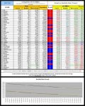
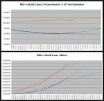
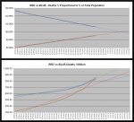
Somehow this appears slightly more readable

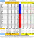
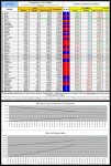
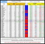
20-11-06 D1 - Red vs Blue - States by Color Sort TABLE.JPG

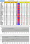
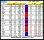
20-11-06 D2 - Red vs Blue - Cases TABLE.JPG

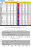
20-11-06 D3 - Red vs Blue - Deaths TABLE.JPG
 
Neat! The more data, the better!

Thank you!

EDIT: Question, what happens if you add the 4% underreporting bias and the 30% Economist underestimation of deaths? (So increase deaths by 30% per state and increase cases and hospitalizations by 4% - you can see what I did for those in my spreadsheet).
 
Neat! The more data, the better!

Thank you!

EDIT: Question, what happens if you add the 4% underreporting bias and the 30% Economist underestimation of deaths? (So increase deaths by 30% per state and increase cases and hospitalizations by 4% - you can see what I did for those in my spreadsheet).

Feel free to do so.

I suspect that if those two were correct, then you would see an increase in all of the individual data points, BUT that the trends would be (essentially) unchanged.

I report what the available data is. I don't say that any individual datum in the available data is accurate. In fact, I'm more concerned with the TRENDS that the available data shows than I am with any individual datum.

Quite frankly the current TRENDS suck dirt big time for the US.

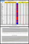
20-11-07 C1 - 7 Day Average GRAPH.JPG

20-11-07 C3 - Mortality Index GRAPH.JPG.JPG
ESPECIALLY the "Red States"

20-11-07 D2 - Red vs Blue - Cases TABLE.JPG
 
New Jersey looking like it's in "good" shape. Seems to me that as COVID-19 gets under control, first it's deaths that taper off. My last update on them, which I did using 11/11's numbers, show less than 1,000 new deaths in the space of a month. If this holds, the next step will be for them to get hospitalizations under control. Seems like a state has really "rounded the corner" when it is reporting less than 1,000 new cases discovered in a week. New Jersey is not near that marker yet.
 
I just updated my spreadsheet. If you can't access the link, I will repaste it.
 
I just updated my spreadsheet. If you can't access the link, I will repaste it.

Would you please.

BTW, feel free to poach any of my charts and/or graphs (giving credit, of course, and NATURALLY a link back to DP).
 
New link is here. I don't know how to edit the OP, otherwise I would have put it there.
 
New link is here. I don't know how to edit the OP, otherwise I would have put it there.

Thanks. Do you do any correlations?

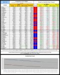
My "State" data tables look like these

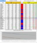
20-11-22 D2 - Red vs Blue - Cases TABLE.JPG
20-11-22 D3 - Red vs Blue - Deaths TABLE.JPG
20-11-22 zD5 - Red vs Blue - Mortality Rate Closed.JPG
(More charts and graphs at Daily Statistical Summary of COVID-19)​
with the attached charts giving a bit of a visual "historical overview" to aid interpretation.

BTW, you cannot amend posts once the time that the system allows for doing so has expired. I think that that is about 20 to 30 minutes, but could well be off (on the high side).

If you consider that it is really important to make a change after that time, I believe that the moderators have that ability and you can contact them by "Starting a Conversation" (what used to be known as "Personal Message". I suspect that the best mod to contact would be "Nota Bene" (some advice which I am sure he will heartily disapprove of me giving).
 
Step 6: " Mold or pinch the stiff edge to the shape of your nose. "

For more info: source

Don't forget the "After making sure that the stiff edge is the top edge" bit.

I kid you not, I have seen trained medical personnel attempting to resuscitate a patient with the mask of the manual ventilator on upside down (needless to say I "spoke sharply" to them).
 
Quote: Thanks. Do you do any correlations?
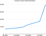
Answer: I wish I knew how to do that on a basic spreadsheet in Numbers. I do have individual graphs for states once they hit less than 1,000 cases discovered per week, but that's about it. By the way, West Virginia's graph is the most disheartening. It tells the story of a state that thought it got the situation under control and then just lost control.

1606223704442.png
 
Quote: Thanks. Do you do any correlations?
Answer: I wish I knew how to do that on a basic spreadsheet in Numbers. I do have individual graphs for states once they hit less than 1,000 cases discovered per week, but that's about it. By the way, West Virginia's graph is the most disheartening. It tells the story of a state that thought it got the situation under control and then just lost control.

View attachment 67306022

Most certainly that doesn't look very "happy making".

Here are today's "state" tables and graphs.

20-11-24 D2 - Red vs Blue - Cases TABLE.JPG
20-11-24 D3 - Red vs Blue - Deaths TABLE.JPG
20-11-24 zD5 - Red vs Blue - Mortality Rate Closed.JPG
(More charts and graphs at Daily Statistical Summary of COVID-19)​


As you can see, the performance of the "Red States" continues to decline at a faster rate than the performance of the "Blue States". In fact, the polynomial trend lines indicate that the "Red States" will overtake the "Blue States" in "Deaths per Million" just before Christmas.
 
I don't think it is the people in a given state based on what I'm seeing in the spreadsheet I update. I believe it is the health policy. Some states have mask mandates, others do not. One of the things I've always wanted to do was compare the public safety/health regulations against each other, and see which ones all states have in common, which ones only the blue states have, etc. For instance, one state I came across not only has their suggested regulations; they actually have diagrams of how the regulations should be employed.

For example, even though the governments of Red/Republican-led states believe that mask mandates are a violation of civil liberty, over 50% of people of every census region believe that a mask mandate would not violate civil liberties, and in the Northeast, South, and West regions, that number is over 60%. So the people seem to want the mask mandate, or at least don't care about it in terms of civil liberty violation.Majorities in all census regions also believe wearing a mask is a matter of public health, not personal expression.

Thus, the problem is actually a disconnect between the leaders of state government and what the people want in those "red" states.

One question I do have that I haven't answered yet is why is Vermont doing so well? It has the lowest deaths, hospitalizations, and overall cases in the country. Any ideas?

Source: Various today.yougov.com polls. Search "mask" and many polls and statements related to this will come up right away.

Well, one possibility to consider is "Maple Syrup".

After all both Canada and Vermont are doing rather better than the US average and both are noted for "Maple Syrup" - right?:)
 

Here's the newest addition. @TU Curmudgeon , have you tried doing a correlation coefficient (CORREL (range 1, range 2)) to see the relationships between Red state and cases and blue states and cases? Something like (CORREL [red state state case number], [population]))? (Not sure if right variables).
 

Here's the newest addition. @TU Curmudgeon , have you tried doing a correlation coefficient (CORREL (range 1, range 2)) to see the relationships between Red state and cases and blue states and cases? Something like (CORREL [red state state case number], [population]))? (Not sure if right variables).

No I haven't (at least I don't think that I have) at least in the way I think that you mean that.

However, if you check the bottom of the first of the "Block 4" charts you will see a summary of the results. Enlarged it looks like this

20-12-04 E1 - Red vs Blue - Summary.JPG
The "Blue States" have LESS (by more than 5%) than their population proportional share of {"cases", MORE of "deaths" and MORE of "recovered". They have LESS (by more than 5%) than the national average of "Cases / Million" (this is where "less is good"), within 5% of "Deaths / Million" and LESS of "Recovered / million (this is where "less is bad").

I think that (other than in someone's PhD dissertation, "Better than _[fill in the blank]_", "About the same as _[fill in the blank]_", and "Worse than _[fill in the blank]_" are quite sufficient for reasonably informed discussion.

Which, however, is NOT to say that I don't recognize the amount of work that you put into your (rather massive) spreadsheet.

How many of your variables do you graph?
 
I don't have any active variables that I graph, but name a column or two, and I can graph them for you, no problem :)
One of the more interesting things I've found is that vaccine acceptance/approval goes up as trust in Trump goes down. Has a correlation coefficient of -0.7, whereas a +1 is a certain "As this goes up, so does this," and -1 is a certain "As this goes down, this goes up" relationship. So not a "perfect" 1:-1 relationship, but very close.

Thank you for recognizing the hard work I'm putting into this :)
 

And I've updated. I've added columns for a CDC 800% Bias. Saw an article that said that the CDC thinks the number of cases are 8x more than reported.
Also finished column of the trust rating of Dr. Fauci. In this one, there is a correlation coefficient of 0.5, meaning there's a positive relationship between Dr. Fauci and vaccine acceptance: the higher the trust in Fauci, the higher the vaccine acceptance would be. However, this does not necessarily hold up all the time.

How do your numbers for today, correlate with your numbers from yesterday?

This is what I have (treating the "Red States" and the "Blue States" as blocks)

20-12-18 D1B - Red vs Blue - States by Color Sort Summary TABLE.JPG
20-12-18 D2B - Red vs Blue - Cases CHART.JPG
20-12-18 D3B - Red vs Blue - Deaths CHART.JPG
 
I update as many stats as I can, manually, during the day. Stats earlier in the alphabet (A, C, D, etc.) are older than others by about 12 days. I wish I could keep more on top of this than that, but life. :)
 
Back
Top Bottom