
- Joined
- Jan 28, 2013
- Messages
- 94,823
- Reaction score
- 28,342
- Location
- Williamsburg, Virginia
- Gender
- Male
- Political Leaning
- Independent
By now most regular visitors to this subforum have seen most of the graphed temperature presentations favored by different posters. This is a review of presentations and the information they actually convey.
 Global Warming in Perspective
“…it is the change in temperature compared to what we’ve been used to that matters.” – Part 2
In this post, we’re going to present graphs that show the annual lowest TMIN and highest TMAX Near-Land Surface Air Temperatures (not in anomaly form) for ten (10) Countries in an effort to add some perspective to global warming. The list of countries, which follows, includes the countries with the highest populations. And, as always…
[FONT="]Normally, global land+ocean surface temperature anomaly data are presented in anomaly form, with the scaling of the y-axis as tight as possible to make the long-term and short-term variations appear large, when, in reality, they’re very small…so small you’d never notice them if it wasn’t for the constant browbeating with alarmist propaganda we’re receiving daily from politicians, from the mainstream media, from businesses whose profits depend on the climate change scare, and from members of the publically funded climate data and modeling businesses, which have to keep their funding alive. An example of a normal presentation of global mean surface temperature (GMST) data can be seen in Reference Figure 1. It is a graph created by NASA GISS (Goddard Institute of Space Studies) and is available at their website here in .png form.[/FONT]
[FONT="]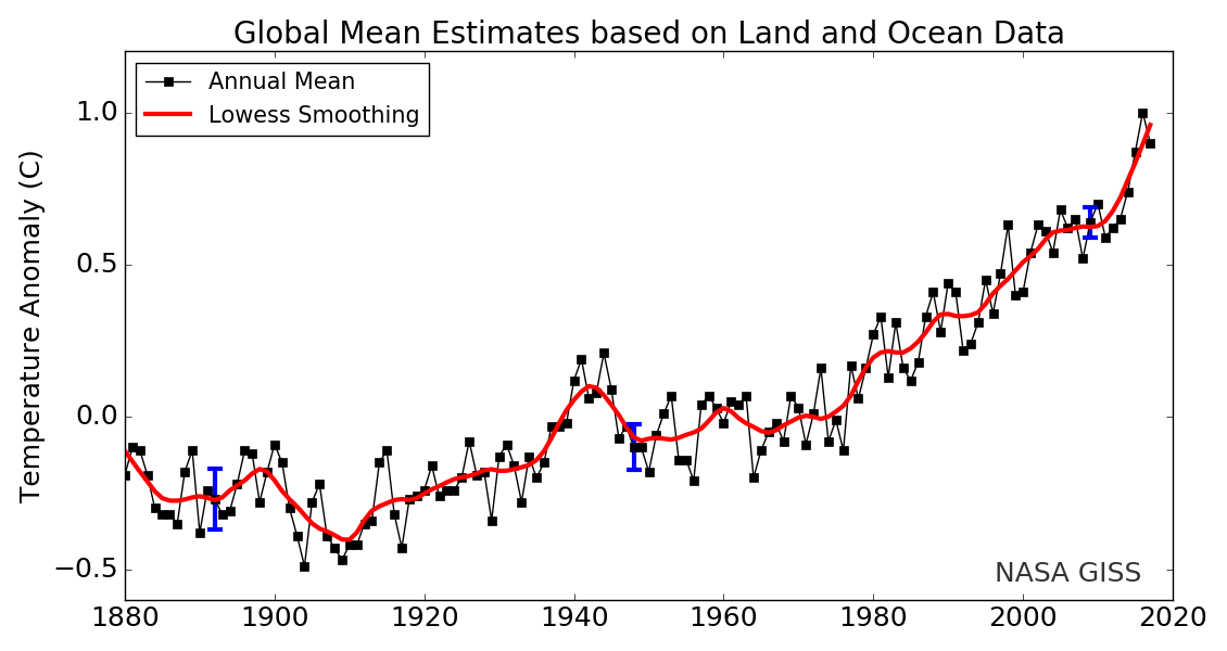
[/FONT]
[FONT="]Reference Figure 2 is an example of what’s being presented in this post, but instead of TMIN and TMAX data for individual countries, the data in Reference Figure 2 is derived from the global mean data for near-surface land air temperatures. The Berkeley Earth global TMAX data for land surfaces are here and the global TMIN data are here. The blue curve toward the bottom includes the data for the annual lowest TMIN temperatures and red curve toward the top includes the data for the annual highest TMAX Near-Land Surface Air Temperatures (not in anomaly form). As noted above, the black curve toward the middle is for the Berkeley Earth annual global mean land+ocean surface temperature anomaly data, referred to on the graph as GMST for Global Mean Surface Temperature. For illustration purposes, and depending on the data for the individual country, I shift the curve [of the] GMST data so that it remains between the curves of the TMIN and TMAX data. With some countries, it’s not necessary and the GMST curve hugs 0.0 deg C. Also included on the graphs for each country are the trends—the warming rates as calculated by MS EXCEL—for the highest annual TMAX temperatures and the lowest annual TMIN temperatures.[/FONT]
[FONT="]Now notice how small the short- and long-term variations in global mean surface temperature (GMST) look. That’s because they are small, but you wouldn’t know that looking at a graph like the one prepared by NASA GISS in Reference Figure 1, above.[/FONT]
[FONT="]
 [/FONT]
[FONT="]
[/FONT]
Global Warming in Perspective“…it is the change in temperature compared to what we’ve been used to that matters.” – Part 2
In this post, we’re going to present graphs that show the annual lowest TMIN and highest TMAX Near-Land Surface Air Temperatures (not in anomaly form) for ten (10) Countries in an effort to add some perspective to global warming. The list of countries, which follows, includes the countries with the highest populations. And, as always…
[FONT="]Normally, global land+ocean surface temperature anomaly data are presented in anomaly form, with the scaling of the y-axis as tight as possible to make the long-term and short-term variations appear large, when, in reality, they’re very small…so small you’d never notice them if it wasn’t for the constant browbeating with alarmist propaganda we’re receiving daily from politicians, from the mainstream media, from businesses whose profits depend on the climate change scare, and from members of the publically funded climate data and modeling businesses, which have to keep their funding alive. An example of a normal presentation of global mean surface temperature (GMST) data can be seen in Reference Figure 1. It is a graph created by NASA GISS (Goddard Institute of Space Studies) and is available at their website here in .png form.[/FONT]
[FONT="]
[/FONT]
[FONT="]Reference Figure 2 is an example of what’s being presented in this post, but instead of TMIN and TMAX data for individual countries, the data in Reference Figure 2 is derived from the global mean data for near-surface land air temperatures. The Berkeley Earth global TMAX data for land surfaces are here and the global TMIN data are here. The blue curve toward the bottom includes the data for the annual lowest TMIN temperatures and red curve toward the top includes the data for the annual highest TMAX Near-Land Surface Air Temperatures (not in anomaly form). As noted above, the black curve toward the middle is for the Berkeley Earth annual global mean land+ocean surface temperature anomaly data, referred to on the graph as GMST for Global Mean Surface Temperature. For illustration purposes, and depending on the data for the individual country, I shift the curve [of the] GMST data so that it remains between the curves of the TMIN and TMAX data. With some countries, it’s not necessary and the GMST curve hugs 0.0 deg C. Also included on the graphs for each country are the trends—the warming rates as calculated by MS EXCEL—for the highest annual TMAX temperatures and the lowest annual TMIN temperatures.[/FONT]
[FONT="]Now notice how small the short- and long-term variations in global mean surface temperature (GMST) look. That’s because they are small, but you wouldn’t know that looking at a graph like the one prepared by NASA GISS in Reference Figure 1, above.[/FONT]
[FONT="]
[FONT="]
[/FONT]