• This is a political forum that is non-biased/non-partisan and treats every person's position on topics equally. This debate forum is not aligned to any political party. In today's politics, many ideas are split between and even within all the political parties. Often we find ourselves agreeing on one platform but some topics break our mold. We are here to discuss them in a civil political debate. If this is your first visit to our political forums, be sure to check out the RULES. Registering for debate politics is necessary before posting. Register today to participate - it's free!

James Hansen's Multiple Failed Global Warming Doomsday Ultimatums

Oh please. Of course I know that. They don't use the same programs today that they used decades ago. Sheesh. That's why there's no contradiction.
The point was that the programs are written in order to support a conclusion. Every paper might use their own program. One additional problem is that too many use existing bad "data" from earlier research.

Again, when the guys who made that claim ran the data through their own 'improved' program, they got....a hockey stick.

See below.

bcf82ddeaa17a14b9fa0ed1796323694.gif
 
Again, when the guys who made that claim ran the data through their own 'improved' program, they got....a hockey stick.

See below.

bcf82ddeaa17a14b9fa0ed1796323694.gif
I am not sure which blog you pulled the graph from, but it was not from McShane and Wyner 2010 unedited.
Just for fun, lets compare the real McShane and Wyner 2010 graph and Mann 2008.
mann_compare.jpg
Do you notice any differences, like maybe the uncertainty bands.
 
I am not sure which blog you pulled the graph from, but it was not from McShane and Wyner 2010 unedited.
Just for fun, lets compare the real McShane and Wyner 2010 graph and Mann 2008.
View attachment 67204028
Do you notice any differences, like maybe the uncertainty bands.

Yes, the uncertainty is higher, as the paper explicitly says. One can make the uncertainty even greater by doing all kinds of statistical assumptions, of course.

But most importantly, and the reason I used a graphic with a hockey stick superimposed, is... do you see any similarities??
 
Yes, the uncertainty is higher, as the paper explicitly says. One can make the uncertainty even greater by doing all kinds of statistical assumptions, of course.

But most importantly, and the reason I used a graphic with a hockey stick superimposed, is... do you see any similarities??
McShane and Wyner 2010
Finally, the proxies seem unable to forecast the high levels of and sharp run-up in temperature in the 1990s either in-sample or from contiguous holdout
blocks, thus casting doubt on their ability to predict such phenomena if in fact they occurred several hundred years ago.
It seems clear the shape of the reconstruction does not reflect much of anything.
The signal is simply too noisy to be useful.
 
Again, when the guys who made that claim ran the data through their own 'improved' program, they got....a hockey stick.

See below.
bcf82ddeaa17a14b9fa0ed1796323694.gif

Great. Run it again until we get a sailboat. I'd prefer a Luders/Allied 34.
 
McShane and Wyner 2010

It seems clear the shape of the reconstruction does not reflect much of anything.
The signal is simply too noisy to be useful.

While that's a conclusion you would like, it's not the conclusion reached.

And that's not even counting the fact that multiple studies have been done post MW2011 and have shown the same thing.


Sent from my iPad using Tapatalk
 
While that's a conclusion you would like, it's not the conclusion reached.

And that's not even counting the fact that multiple studies have been done post MW2011 and have shown the same thing.


Sent from my iPad using Tapatalk
Let me ask you a question.
When a tree records the temperature, is it from the top, the middle or the bottom of the tree?
Also how does that relate to recent (instrument) warming, which has mostly been during the cooler
months when the trees are mostly dormant?
seasonal_Asy.jpg
 
Let me ask you a question.
When a tree records the temperature, is it from the top, the middle or the bottom of the tree?
Also how does that relate to recent (instrument) warming, which has mostly been during the cooler
months when the trees are mostly dormant?
View attachment 67204034

Who cares?

Multiple studies have been done globally on multiple proxies, the vast majority of which are not tree rings.

Your denier position of obsessing about a 17 year old paper and ignoring all the major research done after it is noted.


Sent from my iPad using Tapatalk
 
Who cares?

Multiple studies have been done globally on multiple proxies, the vast majority of which are not tree rings.

Your denier position of obsessing about a 17 year old paper and ignoring all the major research done after it is noted.


Sent from my iPad using Tapatalk
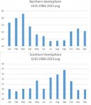
Why do you obsess about temperature proxies, when the instrument data is available that show what my graphic shows.
the majority of the observed warming since 1880, has been in the winter.
Further breaking down the observed warming, so a good majority has been in the evening lows not going as low.
This seasonal and diurnal asymmetry is not accounted for in the models,
 
McShane & Wyner's conclusion:
Our back casting methods, which track quite closely the methods applied most recently in Mann (2008) to the same data,are unable to catch the sharp run up in temperatures recorded in the 1990s, even in-sample.

I think you missed the best bit to high light.

That translates as Mann was lying.
 
Oh please. Of course I know that. They don't use the same programs today that they used decades ago. Sheesh. That's why there's no contradiction.
The point was that the programs are written in order to support a conclusion. Every paper might use their own program. One additional problem is that too many use existing bad "data" from earlier research.

Sigh. Ok, let me explain.

"Hockey stick" charts are referring to paleoclimate temperature reconstructions. Using tree rings, ice cores, and other means to try and determine temperatures from periods before we had thermometers. (or before we even had people!) These records are often compared to the instrumental record over the last ~100 years in which temperatures have climbed significantly, resulting in that "hockey stick" shape. It is these types of charts where some people claim that random data ends up creating a "hockey stick" anyway, supposedly evidence that the software is flawed or fraudulent.

This supposed ice age prediction comes from modeling software designed to predict future temperatures. It is not derived from past temperature data, or proxy temperature data.

They are two completely different tasks.

And here I thought I was explaining it to you because you just weren't getting it.
Let no good deed go unpunished, I guess.
You really need to stop that supercilious screen persona you've chosen if you want anyone to talk to you.
I know you do it because you hope it's annoying but it's not working.
And it doesn't work because you don't actually know anything about the subject and you think you can bluff your way through.
Sorry, but you can't, and no amount of pretense is going to get you out of the corner you've painted yourself into.
Perhaps you can come back after you've read a bit about the subject.
 
Who cares?

Multiple studies have been done globally on multiple proxies, the vast majority of which are not tree rings.

Your denier position of obsessing about a 17 year old paper and ignoring all the major research done after it is noted.


Sent from my iPad using Tapatalk

All proxies have other factors that influence them, and we were not recording the other factors., Then to complicate issues, and invalidate the hockey stick completely, random data produce the hockey stick as well. The method is flawed.
 
I am not sure which blog you pulled the graph from, but it was not from McShane and Wyner 2010 unedited.
Just for fun, lets compare the real McShane and Wyner 2010 graph and Mann 2008.
View attachment 67204028
Do you notice any differences, like maybe the uncertainty bands.

certainty schmertainty
 
Why do you obsess about temperature proxies, when the instrument data is available that show what my graphic shows.
the majority of the observed warming since 1880, has been in the winter.
Further breaking down the observed warming, so a good majority has been in the evening lows not going as low.
This seasonal and diurnal asymmetry is not accounted for in the models,

Well, if my area doesn't see freezing winters, my apples wont grow right...
 
And here I thought I was explaining it to you because you just weren't getting it.
Let no good deed go unpunished, I guess.
You really need to stop that supercilious screen persona you've chosen if you want anyone to talk to you.
I know you do it because you hope it's annoying but it's not working.
And it doesn't work because you don't actually know anything about the subject and you think you can bluff your way through.
Sorry, but you can't, and no amount of pretense is going to get you out of the corner you've painted yourself into.
Perhaps you can come back after you've read a bit about the subject.

No rebuttal? I'm shocked.
 
Well, if my area doesn't see freezing winters, my apples wont grow right...
Chill hours are a concern, but the pace of the change will mean the people who run orchards will transition to
less chill hour trees on the next cycle.
 
And here I thought I was explaining it to you because you just weren't getting it.
Let no good deed go unpunished, I guess.
You really need to stop that supercilious screen persona you've chosen if you want anyone to talk to you.
I know you do it because you hope it's annoying but it's not working.
And it doesn't work because you don't actually know anything about the subject and you think you can bluff your way through.
Sorry, but you can't, and no amount of pretense is going to get you out of the corner you've painted yourself into.
Perhaps you can come back after you've read a bit about the subject.

Funniest.Response.Ever.

This would make a good cartoon.

d3953b01d7a34ad06d6ae9ec51e9f61a.jpg


Sent from my iPad using Tapatalk
 
All proxies have other factors that influence them, and we were not recording the other factors., Then to complicate issues, and invalidate the hockey stick completely, random data produce the hockey stick as well. The method is flawed.

Explain how random data can produce a graph that has a consistent shape.

And after that, explain how the paper that supposedly 'proves' this 'fact' produced a hockey stick when they corrected the issue.

And then, explain how multiple studies coming AFTER this supposedly landmark paper kept finding hockey stick graphs.


Sent from my iPad using Tapatalk

It's all in the conclusion.

Consequently, the long flat handle of thehockey stick is best understood to be a feature of regression and less a reflection ofour knowledge of the truth. Nevertheless, the temperatures of the last few decadeshave been relatively warm compared to many of the 1000-year temperature curvessampled from the posterior distribution of our model.Our main contribution is our efforts to seriously grapple with the uncertaintyinvolved in paleoclimatological reconstructions. Regression of high-dimensionaltime series is always a complex problem with many traps. In our case, the particularchallenges include (i) a short sequence of training data, (ii) more predictors thanobservations, (iii) a very weak signal, and (iv) response and predictor variableswhich are both strongly autocorrelated. The final point is particularly troublesome:since the data is not easily modeled by a simple autoregressive process, it followsthat the number of truly independent observations (i.e., the effective sample size) may be just too small for accurate reconstruction.
 
He doesn't care about facts. Only his confirmation bias.
 
Back
Top Bottom