• This is a political forum that is non-biased/non-partisan and treats every person's position on topics equally. This debate forum is not aligned to any political party. In today's politics, many ideas are split between and even within all the political parties. Often we find ourselves agreeing on one platform but some topics break our mold. We are here to discuss them in a civil political debate. If this is your first visit to our political forums, be sure to check out the RULES. Registering for debate politics is necessary before posting. Register today to participate - it's free!

Daily Statistical Summary of COVID-19

=================================================

GENERAL ADVICE FOR DEALING WITH COVID-19

The best advice anyone can give you is

00 B3 - Dont Panic.JPG

TAKE IT!

AND


..............\|||/ .............
..............
(0 o) ..............
......
,-------ooO-----------,....
......
|…...PLEASE ........| ...
.........
| ..DON'T FEED ...| ......
…......
| .THE TROLLS ...| .......
.....
'--------------Ooo----'....
.............
|__|__| .............
..............
|| ||..............
.............
ooO Ooo.............
==============================================================
 
***********************************************

BLOCK 4A – US States DATA and CORRELATIONS

IN TABLES

***********************************************


HOW IS YOUR STATE DOING?

All base data is from Worldometer as of ~1400 on the date of posting.

NOTE – 1

The Oregon, Delaware, and Alaska data for recovered cases are out of date and there is no newer data available. The “Mortality Rate (Closed)” and “Recovered Rate” are unreliable for those states.
*
NOTE – 2

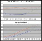
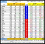
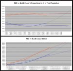
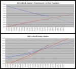
The percentage [top chart at the bottom of the tables] shows how well the “Red States” and “Blue States” are doing in terms of their percentage of the US population. If the “X States” had 50% of the population and 55% of whatever was being measured, then the “X States” would show as 110% while the “Y States” would show as 90%.​

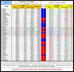
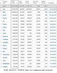
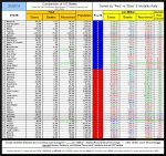
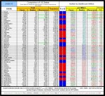
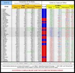
First, the table sorted by "Blue States" (listed by "Mortality Rate [Closed]") and "Red States" (listed by "Mortality Rate [Closed]")

21-01-10 D1a - Red vs Blue - States by Color Sort TABLE.JPG

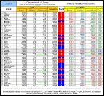
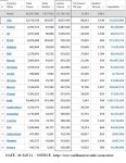
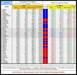
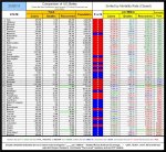
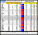
And then sorted by “Cases per Million”

21-01-10 D1b - Red vs Blue - Cases TABLE.JPG

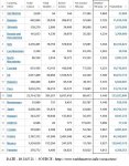
And then sorted by “Deaths per Million”

21-01-10 D1c - Red vs Blue - Deaths TABLE.JPG

Those are OK if you want to look up specific numbers, but, because they are “single data point” tables, they don’t actually show you what is happening over time. For that, see the next block.
 
***********************************************

BLOCK 4B – US States DATA and CORRELATIONS

IN CHARTS

***********************************************


HOW ARE THE "RED" AND "BLUE" STATES DOING?

As you can see from the "Summary" table, BOTH the "Red States" and the "Blue States" have now moved into the blue "±5% of Average" zone on the "Deaths per Million" column. The "Red States" have moved into that zone from the green "LESS that 95% of Average" zone (for those who still believe that their "expert prediction of 10,300 ABSOLUTE MAXIMUM deaths is accurate, that means that their performance is getting worse)and the "Blue States" have moved into that zone from the red "MORE than 105% of Average" zone (for those who still believe that their "expert prediction of 10,300 ABSOLUTE MAXIMUM deaths is accurate, that means that their performance is getting better).

The “Red States” relative percentage of deaths has now moved from the (more than 5% lower than the National Average) “Green Zone” into the (±5% of National Average) “Blue Zone.

The "Blue States" relative percentage of deaths has now moved from the (more than 5% higher than the National Average) “Green Zone” into the (±5% of National Average) “Blue Zone.

21-01-10 D2a - Red vs Blue - States by Color Sort Summary TABLE.JPG

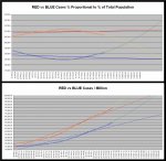
The situation with respect to “Cases per Million” continues NOT to be “happy making”. In fact, NO STATE has a “Cases per Million” rate that is lower than the world average.

The "Red States" increase in "Cases per Million" continues at a faster pace than that of the "Blue States".

21-01-10 D2b - Red vs Blue - Cases CHART.JPG

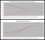
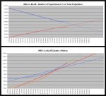
As far as “Deaths per Million” goes, the “Blue States” and the “Red States” are still battling it out to see which can win the "I can kill more of my people than you can" title (and the “Red States” appear to be drawing ahead).

21-01-10 D2c - Red vs Blue - Deaths CHART.JPG
 
***********************************************

BLOCK 5 – US States DATA and CORRELATIONS

Mortality Measurements

***********************************************

The “Mortality Index” continues to climb. That indicates that the number of deaths is increasing faster than the number of tests so you cannot blame the increase in deaths on the increase in tests.

21-01-10 E1 - Mortality Index CHART.JPG

In table format, here is how the individual states are doing

21-01-10 E2 - Red vs Blue - Mortality TABLE.JPG

And to give an overview of how the “Red States” and “Blue States” are doing here is that data reduces to a chart.

21-01-10 E3 - Red vs Blue - Mortality CHART.JPG
 
***********************************************

BLOCK 6 – THE “TOP 20”s

***********************************************

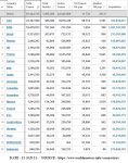
Of the 20 countries with the highest number of TOTAL cases, the US, with around 11.06% of the total population of the group, has around 31.68% of the total cases for the group. This is roughly 2.86 times its proportional share.

21-01-10 F1 - Worldometer TOP TOTAL Cases TABLE.JPG

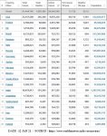
Of the 20 countries with the highest number of currently ACTIVE cases, the US, with around 11.79% of the total population of the group, has around 49.00% of the total cases for the group. This is roughly 4.16 times its proportional share.

21-01-10 F2 - Worldometer TOP Active Cases TABLE.JPG

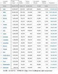
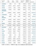
Extracted from Worldometer, here is the list of the 20 countries with the highest number of COVID-19 “Deaths per Million”

21-01-10 F3 - Worldometer TOP Deaths per Million TABLE.JPG

That table shows that those people who are panic mongering and claiming that the US has the world’s highest COVID-19 death rate either simply don’t know what they are talking about or are deliberately attempting to spread false information.

As you can plainly see, <SARC> from that table, all of the countries with higher “Deaths per Million” counts than the US has have those so-called “Universal Healthcare Insurance” programs and that is definitive proof that those so-called “Universal Healthcare Insurance” programs are ineffective and result in the deaths of millions because of their reliance on Death Panels to ration healthcare (unlike the US where you get all the healthcare that you can pay for out of your own pocket) </SARC>.

.
 
***********************************************

BLOCK 7 – US States DATA and CORRELATIONS

Mortality Measurements

***********************************************

The fact that the total number of US deaths continues to rise isn’t going to surprise anyone other than Dr. Mashmont who jusknowz that the ABSOLUTE MAXIMUM number of COVID-19 deaths peaked out at 10,300 and that there hasn’t been a single COVID-19 death in the US since April 4, 2020.

21-01-10 G1 - Total US Deaths.JPG

In the past 24 hours, the US (with approximately 4.26% of the world’s population) has had approximately 25.16% of the world’s COVID-19 cases. That is a disparity of 5.91 :: 1 (which is a “Percentage Grade” of 16.92%). It also has 19.69% of the world’s COVID-19 deaths, which is a disparity of 4.62 :: 1 (which is a “Percentage Grade” of 21.62%). Each of those “Percentage Grades” is an “F”

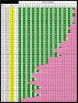
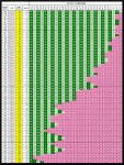
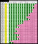
A more easily grasped illustration of what the "Daily Death Rate" is doing in the US is

21-01-10 G2 - The Fading of the Green TABLE.JPG

Comparing “chance of death” (a combination of “chance of infection” and “mortality rate) to “ability to pay” (PPP GDP per capita) and “previous support for healthcare system” (per capita spending on health care), the data is indicative that the US could have done considerably better than it actually did.

21-01-10 G3b - Death by ABILITY to Pay SHORT TABLE.JPG
 
MEA CULPA

There was a data entry problem (read as "finger fumble") in yesterday's data. Do not rely on those tables and charts.

The "issue" has been resolved.
 
***********************************************

BLOCK 1 - DATA and CORRELATIONS

***********************************************

Compare how the “G-8+China” group, an aggregated “Europe” and an aggregated “World” are doing vis-à-vis each other.

21-01-11 A1 - G8 + CHINA COVID TABLE.JPG

***********************************************​

Projections based on the trends current as of the day of posting showing how COVID-19 is likely to progress, its likely total in its first year in the US, and comparing its effect with that of the “Spanish Flu”

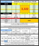
21-01-11 A2 - COVID vs Other Causes TABLE.JPG

COVID-19 is now the THIRD largest cause of death in the US.

The next "Grim Mortality Milestone” is the psychologically significant number

400,000

IF the current trends continue, THEN this number will be reached on or about 16 JAN 21.

***********************************************​

This table shows how well the various areas are doing with respect to both the US and the World after adjustments for various factors. To see how well likely a random person in the “G-8+China” group, an aggregated “Europe” or an aggregated “World” is to die from COVID-19 (which is a combination of the answers to the questions “How likely am I to catch COVID-19?” and “If I do catch COVID-19, then how likely am I to die from it?”) as well as how well the areas are doing in respect of their (per capita) relative abilities to pay for fighting COVID-19 and with respect to the (per capita) amount that they previously spent on supporting their healthcare systems you will have to go to the Block 6 and look at the final table.

21-01-11 A3 - Comparison of Ratios TABLE.JPG
 
***********************************************

BLOCK 2 - DATA

(WITH ARROWS [for the graduates of the BS (Statistics) program at The University of Numerology])

***********************************************

QUICK SUMMARY
OF Comparative COVID-19 (Total Deaths/Total Cases) & Mortality Closed %

- Data source - COVID-19 Coronavirus Pandemic (at aprox. 1400 Z on the date of posting) -

See “General Notes” for caveats as to accuracy of data and “Mortality Rate (Closed)” use.

20/10/20 – World (1,124,519/40,749,872) 3.57% [⇓] / USA (225,269/8,459,967) 3.93% [⇓] / Canada (9,778/201,437) 5.45% [⇓]
20/10/25 – World (1,156,181/43,055,448) 3.51% [⇓] / USA (230,086/8,831,449) 3.85% [⇓] / Canada (9,922/213,959) 5.23% [⇓]
20/10/30 – World (1,188,262/45,475,853) 3.47% [⇓] / USA (234,218/9,521,474) 3.77% [⇓] / Canada (10,074/228,542) 5.00% [⇓]
20/11/05 – World (1,233,212/48,588,813) 3.42% [⇓] / USA (239,842/9,802,374) 3.67% [⇓] / Canada (10,331/247,703) 4.78% [⇓]
20/11/10 – World (1,271,398/51,359,570) 3.40% [↭] / USA (244,449/10,422,026) 3.60% [⇓] / Canada (10,564/268,735) 4.61% [⇓]
20/11/15 – World (1,320,932/54,506,572) 3.36% [⇓] / USA (251,285/11,235,666) 3.52% [⇓] / Canada (10,891/291,931) 4.47% [⇓]
20/11/20 – World (1,368,622/57,394,073) 3.32% [↭] / USA (258,363/12,075,243) 3.44% [⇓] / Canada (11,265/315,754) 4.27% [⇓]
20/11/25 – World (1,417,896/60,242,064) 3.29% [↭] / USA (265,986/12,958,805) 3.36% [⇓] / Canada (11,618/342,444) 4.08% [⇓]
20/11/30 – World (1,467,511/63,199,555) 3.25% [⇓] / USA (273,126/13,753,146) 3.26% [⇓] / Canada (12,032/307,278) 3.93% [⇓]
20/12/05 – World (1,527,740/66,408,088) 3.22% [↭] / USA (285,786/14,784,826) 3.19% [⇓] / Canada (12,496/402,569) 3.76% [⇓]
20/12/10 – World (1,579,100/69,418,464) 3.17% [⇓] / USA (296,836/15,829,017) 3.11% [⇓] / Canada (12,983/435,330) 3.58% [⇓]
20/12/15 – World (1,631,067/73,337,911) 3.07% [⇓] / USA (308,091/16,943,897) 3.02% [⇓] / Canada (13,553/468,862) 3.45% [⇓]
20/12/20 – World (1,694,129/76,728,477) 3.05% [⇓] / USA (323,404/18,078,925) 2.98% [⇓] / Canada (14,154/501,594) 3.33% [⇓]
20/12/25 – World (1,751,877/79,864,734) 3.02% [↭] / USA (337,075/19,113,266) 2.92% [↭] / Canada (14,719/535,212) 3.21% [⇓]
20/12/30 – World (1,800,115/82,477,841) 2.99% [↭] / USA (346,604/19,979,759) 2.84% [⇓] / Canada (15,378/565,506) 3.12% [⇓]
21/01/03 – World (1,845,295/85,059,060) 2.97% [⇓] / USA (358,682/20,904,701) 2.82% [⇓] / Canada (15,715/590,280) 3.08% [⇓]
21/01/04 – World (1,852,796/85,593,845) 2.97% [↭] / USA (360,078/21,113,528) 2.81% [⇓] / Canada (15,865/601,663) 3.05% [⇓]
21/01/05 – World (1,863,908/86,250,039) 2.96% [⇓] / USA (362,130/21,354,933) 2.76% [⇓] / Canada (16,074/611,424) 3.00% [⇓]
21/01/06 – World (1,879,134/86,986,256) 2.96% [↭] / USA (365,740/21,588,382) 2.76% [↭] / Canada (16,233/618,646) 3.01% [⇑]
21/01/07 – World (1,894,383/87,789,918) 2.91% [⇓] / USA (370,009/21,051,520) 2.76% [↭] / Canada (16,369/628,800) 2.99% [⇓]
21/01/08 – World (1,910,036/88,682,228) 2.91% [↭] / USA (374,391/22,152,595) 2.77% [⇑] / Canada (16,579/635,134) 2.99% [↭]
21/01/09 – World (1,924,689/89,494,133) 2.91% [↭] / USA (378,297/22,469,545) 2.77% [↭] / Canada (16,707/644,348) 2.97% [⇓]
20/01/10 – World (1,937,942/90,267,680) 2.91% [↭] / USA (381,557/22,714,728) 2.77% [↭] / Canada (16,833/652,473) 2.96% [⇓]
21/01/11 – World (1,945,213/90,801,879) 2.91% [↭] / USA (383,330/22,926,411) 2.76% [⇓] / Canada (16,950/660,289) 2.94% [⇓]

***********************************************​

The “Rolling 7 day US average deaths per day” TODAY is 3,322 (YESTERDAY it was 3,268).

The US, the 10 day average of the “Rolling 7 day US average deaths per day” is BELOW 3,000for the first day in four days.

The US mortality rate for CLOSED cases is still dropping (maybe).

21-01-11 B1 - Mortality Rate CLOSED GRAPH.JPG

The number of deaths per day data has returned to acting “normally”.

21-01-11 B2 - US Daily Deaths.JPG

How are the major nations coping? This chart, from Our World in Data

21-01-11 B3 - Our World in Data CDC G-8 plus China GRAPH.JPG

illustrates the relative growth rates of COVID-19 in those areas.

Europe IS in the midst of "The Second Wave" of COVID-19. Is the US in a "(First?) Second (Third?) Wave"? See the next block and draw your own conclusions.
 
Last edited:
***********************************************

BLOCK 3 – TODAY’S “WAVE(?)”CHARTS

***********************************************


Today’s charts are based on Worldometer data as of approximately 1400 Z on the day of posting)

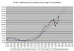
21-01-11 C1 - 7 Day Average GRAPH.JPG

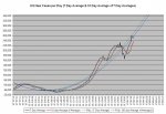
The rolling "7 Day Average" death rate is now higher than it has been since the beginning of May (shortly after Mr. Trump announced that COVID-19 would "vanish in a couple of weeks”).

21-01-11 C2 - 10 Day Average of Averages GRAPH.JPG

The rolling "10 Day Average of the 7 Day Averages" (which gives a much "cleaner" charting) death rate is now higher than it has been since the beginning of May (shortly after Mr. Trump announced that COVID-19 would "vanish in a couple of weeks").

21-01-11 C3 - Daily NEW Case Averages.JPG

The "New Cases per Day" numbers may be unreliable due to the combined effect of a weekend and “The Christmas Effect”. This might last into the new year. The daily average of new cases for the past 30 days is 220,977, for the past 10 days it is 246,606, and for the past five days it is 267,606.

Is this the “Second Wave” or the "Third Wave"? Will there be another? Will the US simply continue its (essentially) straight line path without leveling until the pandemic crests and crashes? Draw your own conclusions from the charts and the facts NOT from the latest version of the currently operative, officially sanctioned, "Team Trump" approved, White House issued, truth-of-the-day as delivered by the -ONAN- (oops, sorry, that's) OANN people.
 
***********************************************

BLOCK 4A – US States DATA and CORRELATIONS

IN TABLES

***********************************************


HOW IS YOUR STATE DOING?

All base data is from Worldometer as of ~1400 on the date of posting.

NOTE – 1

The Oregon, Delaware, and Alaska data for recovered cases are out of date and there is no newer data available. The “Mortality Rate (Closed)” and “Recovered Rate” are unreliable for those states.
*
NOTE – 2

The percentage [top chart at the bottom of the tables] shows how well the “Red States” and “Blue States” are doing in terms of their percentage of the US population. If the “X States” had 50% of the population and 55% of whatever was being measured, then the “X States” would show as 110% while the “Y States” would show as 90%.​

First, the table sorted by "Blue States" (listed by "Mortality Rate [Closed]") and "Red States" (listed by "Mortality Rate [Closed]")

21-01-11 D1a - Red vs Blue - States by Color Sort TABLE.JPG

And then sorted by “Cases per Million”

21-01-11 D1b - Red vs Blue - Cases TABLE.JPG

And then sorted by “Deaths per Million”

21-01-11 D1c - Red vs Blue - Deaths TABLE.JPG

Those are OK if you want to look up specific numbers, but, because they are “single data point” tables, they don’t actually show you what is happening over time. For that, see the next block.
 
***********************************************

BLOCK 4B – US States DATA and CORRELATIONS

IN CHARTS

***********************************************


HOW ARE THE "RED" AND "BLUE" STATES DOING?

As you can see from the "Summary" table, BOTH the "Red States" and the "Blue States" have now moved into the blue "±5% of Average" zone on the "Deaths per Million" column. The "Red States" have moved into that zone from the green "LESS that 95% of Average" zone (for those who still believe that their "expert prediction of 10,300 ABSOLUTE MAXIMUM deaths is accurate, that means that their performance is getting worse)and the "Blue States" have moved into that zone from the red "MORE than 105% of Average" zone (for those who still believe that their "expert prediction of 10,300 ABSOLUTE MAXIMUM deaths is accurate, that means that their performance is getting better).

The “Red States” relative percentage of deaths has now moved from the (more than 5% lower than the National Average) “Green Zone” into the (±5% of National Average) “Blue Zone.

The "Blue States" relative percentage of deaths has now moved from the (more than 5% higher than the National Average) “Green Zone” into the (±5% of National Average) “Blue Zone.

21-01-11 D2a - Red vs Blue - States by Color Sort Summary TABLE.JPG

The situation with respect to “Cases per Million” continues NOT to be “happy making”. In fact, NO STATE has a “Cases per Million” rate that is lower than the world average.

The "Red States" increase in "Cases per Million" continues at a faster pace than that of the "Blue States".

21-01-11 D2b - Red vs Blue - Cases CHART.JPG

As far as “Deaths per Million” goes, the “Blue States” and the “Red States” are still battling it out to see which can win the "I can kill more of my people than you can" title (and the “Red States” appear to be drawing ahead).

21-01-11 D2c - Red vs Blue - Deaths CHART.JPG
 
***********************************************

BLOCK 5 – US States DATA and CORRELATIONS

Mortality Measurements

***********************************************

The “Mortality Index” continues to climb. That indicates that the number of deaths is increasing faster than the number of tests so you cannot blame the increase in deaths on the increase in tests.

21-01-11 E1 - Mortality Index CHART.JPG

In table format, here is how the individual states are doing

21-01-11 E2 - Red vs Blue - Mortality TABLE.JPG

And to give an overview of how the “Red States” and “Blue States” are doing here is that data reduces to a chart.

21-01-11 E3 - Red vs Blue - Mortality CHART.JPG
 
***********************************************

BLOCK 6 – THE “TOP 20”s

***********************************************

Of the 20 countries with the highest number of TOTAL cases, the US, with around 10.17% of the total population of the group, has around 31.76% of the total cases for the group. This is roughly 3.12 times its proportional share.

21-01-11 F1 - Worldometer TOP TOTAL Cases TABLE.JPG

Of the 20 countries with the highest number of currently ACTIVE cases, the US, with around 11.79% of the total population of the group, has around 49.13% of the total cases for the group. This is roughly 4.17 times its proportional share.

21-01-11 F2 - Worldometer TOP Active Cases TABLE.JPG

Extracted from Worldometer, here is the list of the 20 countries with the highest number of COVID-19 “Deaths per Million”

21-01-11 F3 - Worldometer TOP Deaths per Million TABLE.JPG

That table shows that those people who are panic mongering and claiming that the US has the world’s highest COVID-19 death rate either simply don’t know what they are talking about or are deliberately attempting to spread false information.

As you can plainly see, <SARC> from that table, all of the countries with higher “Deaths per Million” counts than the US has have those so-called “Universal Healthcare Insurance” programs and that is definitive proof that those so-called “Universal Healthcare Insurance” programs are ineffective and result in the deaths of millions because of their reliance on Death Panels to ration healthcare (unlike the US where you get all the healthcare that you can pay for out of your own pocket) </SARC>.
 
***********************************************

BLOCK 7 – US States DATA and CORRELATIONS

Mortality Measurements

***********************************************

The fact that the total number of US deaths continues to rise isn’t going to surprise anyone other than Dr. Mashmont who jusknowz that the ABSOLUTE MAXIMUM number of COVID-19 deaths peaked out at 10,300 and that there hasn’t been a single COVID-19 death in the US since April 4, 2020.

21-01-11 G1 - Total US Deaths.JPG

In the past 24 hours, the US (with approximately 4.26% of the world’s population) has had approximately 25.25% of the world’s COVID-19 cases. That is a disparity of 5.93 :: 1 (which is a “Percentage Grade” of 16.86%). It also has 19.71% of the world’s COVID-19 deaths, which is a disparity of 4.63 :: 1 (which is a “Percentage Grade” of 21.62%). Each of those “Percentage Grades” is an “F”

A more easily grasped illustration of what the "Daily Death Rate" is doing in the US is this table (which I screwed up yesterday)

21-01-11 G2 - The Fading of the Green TABLE.JPG

Comparing “chance of death” (a combination of “chance of infection” and “mortality rate) to “ability to pay” (PPP GDP per capita) and “previous support for healthcare system” (per capita spending on health care), the data is indicative that the US could have done considerably better than it actually did.

21-01-11 G3b - Death by ABILITY to Pay SHORT TABLE.JPG
 
***********************************************

BLOCK 8 – VACCINATIONS

***********************************************

The US continues to lead the world in its vaccination rate.

21-01-11 - COVID Vaccination Rates.JPG
 
***********************************************

BLOCK 8 – VACCINATIONS

(Yes, I know it’s out of sequence, but a lot of people are interested in it.)

***********************************************

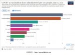
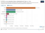
The US, at #2, continues to do well with respect to per capita vaccination rates.

21-01-12 H1 - COVID Vaccination Rates PER 100.JPG

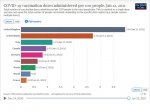
The US, at #2, is also doing well with respect to total vaccinations.

21-01-12 H2 - COVID Vaccinations TOTAL.JPG

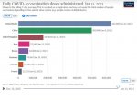
The US continues to lead in daily vaccinations

21-01-12 H3 - COVID Vaccinations DAILY RATE.JPG
 
***********************************************

BLOCK 1 - DATA and CORRELATIONS

***********************************************

Compare how the “G-8+China” group, an aggregated “Europe” and an aggregated “World” are doing vis-à-vis each other.

21-01-12 A1 - G8 + CHINA COVID TABLE.JPG

***********************************************​

Projections based on the trends current as of the day of posting showing how COVID-19 is likely to progress, its likely total in its first year in the US, and comparing its effect with that of the “Spanish Flu”

21-01-12 A2 - COVID vs Other Causes TABLE.JPG

COVID-19 is now the THIRD largest cause of death in the US.

The next "Grim Mortality Milestone” is the psychologically significant number

400,000

IF the current trends continue, THEN this number will be reached on or about 16 JAN 21.

***********************************************​

This table shows how well the various areas are doing with respect to both the US and the World after adjustments for various factors. To see how well likely a random person in the “G-8+China” group, an aggregated “Europe” or an aggregated “World” is to die from COVID-19 (which is a combination of the answers to the questions “How likely am I to catch COVID-19?” and “If I do catch COVID-19, then how likely am I to die from it?”) as well as how well the areas are doing in respect of their (per capita) relative abilities to pay for fighting COVID-19 and with respect to the (per capita) amount that they previously spent on supporting their healthcare systems you will have to go to the Block 6 and look at the final table.

21-01-12 A3 - Comparison of Ratios TABLE.JPG
 
***********************************************

BLOCK 2 - DATA

(WITH ARROWS [for the graduates of the BS (Statistics) program at The University of Numerology])

***********************************************

QUICK SUMMARY
OF Comparative COVID-19 (Total Deaths/Total Cases) & Mortality Closed %

- Data source - COVID-19 Coronavirus Pandemic (at aprox. 1400 Z on the date of posting) -

See “General Notes” for caveats as to accuracy of data and “Mortality Rate (Closed)” use.

20/10/20 – World (1,124,519/40,749,872) 3.57% [⇓] / USA (225,269/8,459,967) 3.93% [⇓] / Canada (9,778/201,437) 5.45% [⇓]

20/10/25 – World (1,156,181/43,055,448) 3.51% [⇓] / USA (230,086/8,831,449) 3.85% [⇓] / Canada (9,922/213,959) 5.23% [⇓]

20/10/30 – World (1,188,262/45,475,853) 3.47% [⇓] / USA (234,218/9,521,474) 3.77% [⇓] / Canada (10,074/228,542) 5.00% [⇓]

20/11/05 – World (1,233,212/48,588,813) 3.42% [⇓] / USA (239,842/9,802,374) 3.67% [⇓] / Canada (10,331/247,703) 4.78% [⇓]

20/11/10 – World (1,271,398/51,359,570) 3.40% [↭] / USA (244,449/10,422,026) 3.60% [⇓] / Canada (10,564/268,735) 4.61% [⇓]

20/11/15 – World (1,320,932/54,506,572) 3.36% [⇓] / USA (251,285/11,235,666) 3.52% [⇓] / Canada (10,891/291,931) 4.47% [⇓]

20/11/20 – World (1,368,622/57,394,073) 3.32% [↭] / USA (258,363/12,075,243) 3.44% [⇓] / Canada (11,265/315,754) 4.27% [⇓]

20/11/25 – World (1,417,896/60,242,064) 3.29% [↭] / USA (265,986/12,958,805) 3.36% [⇓] / Canada (11,618/342,444) 4.08% [⇓]

20/11/30 – World (1,467,511/63,199,555) 3.25% [⇓] / USA (273,126/13,753,146) 3.26% [⇓] / Canada (12,032/307,278) 3.93% [⇓]

20/12/05 – World (1,527,740/66,408,088) 3.22% [↭] / USA (285,786/14,784,826) 3.19% [⇓] / Canada (12,496/402,569) 3.76% [⇓]

20/12/10 – World (1,579,100/69,418,464) 3.17% [⇓] / USA (296,836/15,829,017) 3.11% [⇓] / Canada (12,983/435,330) 3.58% [⇓]

20/12/15 – World (1,631,067/73,337,911) 3.07% [⇓] / USA (308,091/16,943,897) 3.02% [⇓] / Canada (13,553/468,862) 3.45% [⇓]

20/12/20 – World (1,694,129/76,728,477) 3.05% [⇓] / USA (323,404/18,078,925) 2.98% [⇓] / Canada (14,154/501,594) 3.33% [⇓]

20/12/25 – World (1,751,877/79,864,734) 3.02% [↭] / USA (337,075/19,113,266) 2.92% [↭] / Canada (14,719/535,212) 3.21% [⇓]

20/12/30 – World (1,800,115/82,477,841) 2.99% [↭] / USA (346,604/19,979,759) 2.84% [⇓] / Canada (15,378/565,506) 3.12% [⇓]

21/01/03 – World (1,845,295/85,059,060) 2.97% [⇓] / USA (358,682/20,904,701) 2.82% [⇓] / Canada (15,715/590,280) 3.08% [⇓]

21/01/04 – World (1,852,796/85,593,845) 2.97% [↭] / USA (360,078/21,113,528) 2.81% [⇓] / Canada (15,865/601,663) 3.05% [⇓]

21/01/05 – World (1,863,908/86,250,039) 2.96% [⇓] / USA (362,130/21,354,933) 2.76% [⇓] / Canada (16,074/611,424) 3.00% [⇓]

21/01/06 – World (1,879,134/86,986,256) 2.96% [↭] / USA (365,740/21,588,382) 2.76% [↭] / Canada (16,233/618,646) 3.01% [⇑]

21/01/07 – World (1,894,383/87,789,918) 2.91% [⇓] / USA (370,009/21,051,520) 2.76% [↭] / Canada (16,369/628,800) 2.99% [⇓]

21/01/08 – World (1,910,036/88,682,228) 2.91% [↭] / USA (374,391/22,152,595) 2.77% [⇑] / Canada (16,579/635,134) 2.99% [↭]

21/01/09 – World (1,924,689/89,494,133) 2.91% [↭] / USA (378,297/22,469,545) 2.77% [↭] / Canada (16,707/644,348) 2.97% [⇓]

20/01/10 – World (1,937,942/90,267,680) 2.91% [↭] / USA (381,557/22,714,728) 2.77% [↭] / Canada (16,833/652,473) 2.96% [⇓]

21/01/11 – World (1,945,213/90,801,879) 2.91% [↭] / USA (383,330/22,926,411) 2.76% [⇓] / Canada (16,950/660,289) 2.94% [⇓]

21/01/12 – World (1,956,386/91,444,745) 2.90% [⇓] / USA (385,380/23,147,508) 2.74% [⇓] / Canada (17,086/668,181) 2.92% [⇓]


***********************************************​

The “Rolling 7 day US average deaths per day” TODAY is 3,321 (YESTERDAY it was 3,322).

The US, the 10 day average of the “Rolling 7 day US average deaths per day” is BELOW 2,900for the second day in a row.

The US mortality rate for CLOSED cases is still dropping (maybe).

21-01-12 B1 - Mortality Rate CLOSED GRAPH.JPG

The number of deaths per day data has returned to acting “normally”.

21-01-12 B2 - US Daily Deaths.JPG

How are the major nations coping? This chart, from Our World in Data

21-01-12 B3 - Our World in Data CDC G-8 plus China GRAPH.JPG

illustrates the relative growth rates of COVID-19 in those areas.

Europe IS in the midst of "The Second Wave" of COVID-19. Is the US in a "(First?) Second (Third?) Wave"? See the next block and draw your own conclusions.
 
***********************************************

BLOCK 3 – TODAY’S “WAVE(?)”CHARTS

***********************************************


Today’s charts are based on Worldometer data as of approximately 1400 Z on the day of posting)

21-01-12 C1 - 7 Day Average GRAPH.JPG

The rolling "7 Day Average" death rate is now higher than it has been since the beginning of May (shortly after Mr. Trump announced that COVID-19 would "vanish in a couple of weeks”).

21-01-12 C2 - 10 Day Average of Averages GRAPH.JPG

The rolling "10 Day Average of the 7 Day Averages" (which gives a much "cleaner" charting) death rate is now higher than it has been since the beginning of May (shortly after Mr. Trump announced that COVID-19 would "vanish in a couple of weeks").

21-01-12 C3 - Daily NEW Case Averages.JPG

The "New Cases per Day" numbers may be unreliable due to the combined effect of a weekend and “The Christmas Effect”. This might last into the new year. The daily average of new cases for the past 30 days is 219,657, for the past 10 days it is 252,848, and for the past five days it is 257,620.

Is this the “Second Wave” or the "Third Wave"? Will there be another? Will the US simply continue its (essentially) straight line path without leveling until the pandemic crests and crashes? Draw your own conclusions from the charts and the facts NOT from the latest version of the currently operative, officially sanctioned, "Team Trump" approved, White House issued, truth-of-the-day as delivered by the -ONAN- (oops, sorry, that's) OANN people.
 
***********************************************

BLOCK 4A – US States DATA and CORRELATIONS

IN TABLES

***********************************************


HOW IS YOUR STATE DOING?

All base data is from Worldometer as of ~1400 on the date of posting.

NOTE – 1

The Oregon, Kansas, Delaware, and Alaska data for recovered cases are out of date and there is no newer data available. The “Mortality Rate (Closed)” and “Recovered Rate” are unreliable for those states.
*
NOTE – 2

The percentage [top chart at the bottom of the tables] shows how well the “Red States” and “Blue States” are doing in terms of their percentage of the US population. If the “X States” had 50% of the population and 55% of whatever was being measured, then the “X States” would show as 110% while the “Y States” would show as 90%.​
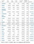
First, the table sorted by "Blue States" (listed by "Mortality Rate [Closed]") and "Red States" (listed by "Mortality Rate [Closed]")

21-01-12 D1a - Red vs Blue - States by Color Sort TABLE.JPG

And then sorted by “Cases per Million”

21-01-12 D1b - Red vs Blue - Cases TABLE.JPG

And then sorted by “Deaths per Million”

21-01-12 D1c - Red vs Blue - Deaths TABLE.JPG

Those are OK if you want to look up specific numbers, but, because they are “single data point” tables, they don’t actually show you what is happening over time. For that, see the next block.
 
***********************************************

BLOCK 4B – US States DATA and CORRELATIONS

IN CHARTS

***********************************************


HOW ARE THE "RED" AND "BLUE" STATES DOING?

As you can see from the "Summary" table, BOTH the "Red States" and the "Blue States" have now moved into the blue "±5% of Average" zone on the "Deaths per Million" column. The "Red States" have moved into that zone from the green "LESS that 95% of Average" zone (for those who still believe that their "expert prediction of 10,300 ABSOLUTE MAXIMUM deaths is accurate, that means that their performance is getting worse)and the "Blue States" have moved into that zone from the red "MORE than 105% of Average" zone (for those who still believe that their "expert prediction of 10,300 ABSOLUTE MAXIMUM deaths is accurate, that means that their performance is getting better).

The “Red States” relative percentage of deaths has now moved from the (more than 5% lower than the National Average) “Green Zone” into the (±5% of National Average) “Blue Zone.

The "Blue States" relative percentage of deaths has now moved from the (more than 5% higher than the National Average) “Green Zone” into the (±5% of National Average) “Blue Zone.

21-01-12 D2a - Red vs Blue - States by Color Sort Summary TABLE.JPG

The situation with respect to “Cases per Million” continues NOT to be “happy making”. In fact, NO STATE has a “Cases per Million” rate that is lower than the world average.

The "Red States" increase in "Cases per Million" continues at a faster pace than that of the "Blue States".

21-01-12 D2b - Red vs Blue - Cases CHART.JPG

As far as “Deaths per Million” goes, the “Blue States” and the “Red States” are still battling it out to see which can win the "I can kill more of my people than you can" title (and the “Red States” appear to be drawing ahead).

21-01-12 D2c - Red vs Blue - Deaths CHART.JPG
 
***********************************************

BLOCK 5 – US States DATA and CORRELATIONS

Mortality Measurements

***********************************************

The “Mortality Index” continues to climb. That indicates that the number of deaths is increasing faster than the number of tests so you cannot blame the increase in deaths on the increase in tests.

21-01-12 E1 - Mortality Index CHART.JPG

In table format, here is how the individual states are doing

21-01-12 E2 - Red vs Blue - Mortality TABLE.JPG

And to give an overview of how the “Red States” and “Blue States” are doing here is that data reduces to a chart.

21-01-12 E3 - Red vs Blue - Mortality CHART.JPG
 
***********************************************

BLOCK 6 – THE “TOP 20”s

***********************************************

Of the 20 countries with the highest number of TOTAL cases, the US, with around 10.17% of the total population of the group, has around 31.84% of the total cases for the group. This is roughly 3.13 times its proportional share.

21-01-12 F1 - Worldometer TOP TOTAL Cases TABLE.JPG

Of the 20 countries with the highest number of currently ACTIVE cases, the US, with around 11.81% of the total population of the group, has around 49.17% of the total cases for the group. This is roughly 4.16 times its proportional share.

21-01-12 F2 - Worldometer TOP Active Cases TABLE.JPG

Extracted from Worldometer, here is the list of the 20 countries with the highest number of COVID-19 “Deaths per Million”

21-01-12 F3 - Worldometer TOP Deaths per Million TABLE.JPG

That table shows that those people who are panic mongering and claiming that the US has the world’s highest COVID-19 death rate either simply don’t know what they are talking about or are deliberately attempting to spread false information.

As you can plainly see, <SARC> from that table, all of the countries with higher “Deaths per Million” counts than the US has have those so-called “Universal Healthcare Insurance” programs and that is definitive proof that those so-called “Universal Healthcare Insurance” programs are ineffective and result in the deaths of millions because of their reliance on Death Panels to ration healthcare (unlike the US where you get all the healthcare that you can pay for out of your own pocket) </SARC>.
 
***********************************************

BLOCK 7 – US States DATA and CORRELATIONS

Mortality Measurements

***********************************************

The fact that the total number of US deaths continues to rise isn’t going to surprise anyone other than Dr. Mashmont who jusknowz that the ABSOLUTE MAXIMUM number of COVID-19 deaths peaked out at 10,300 and that there hasn’t been a single COVID-19 death in the US since April 4, 2020.

21-01-12 G1 - Total US Deaths.JPG

In the past 24 hours, the US (with approximately 4.26% of the world’s population) has had approximately 25.31% of the world’s COVID-19 cases. That is a disparity of 5.95 :: 1 (which is a “Percentage Grade” of 16.82%). It also has 19.70% of the world’s COVID-19 deaths, which is a disparity of 4.63 :: 1 (which is a “Percentage Grade” of 21.62%).

Each of those “Percentage Grades” is an “F”

A more easily grasped illustration of what the "Daily Death Rate" is doing in the US is

21-01-12 G2 - The Fading of the Green TABLE.JPG

Comparing “chance of death” (a combination of “chance of infection” and “mortality rate) to “ability to pay” (PPP GDP per capita) and “previous support for healthcare system” (per capita spending on health care), the data is indicative that the US could have done considerably better than it actually did.

NOTE - Yesterday's table had "finger fumble issues".

21-01-12 G3b - Death by ABILITY to Pay SHORT TABLE.JPG
 
Back
Top Bottom