• This is a political forum that is non-biased/non-partisan and treats every person's position on topics equally. This debate forum is not aligned to any political party. In today's politics, many ideas are split between and even within all the political parties. Often we find ourselves agreeing on one platform but some topics break our mold. We are here to discuss them in a civil political debate. If this is your first visit to our political forums, be sure to check out the RULES. Registering for debate politics is necessary before posting. Register today to participate - it's free!

CLAIM: NASA Data Tampering Doubles Sea Level Rise...

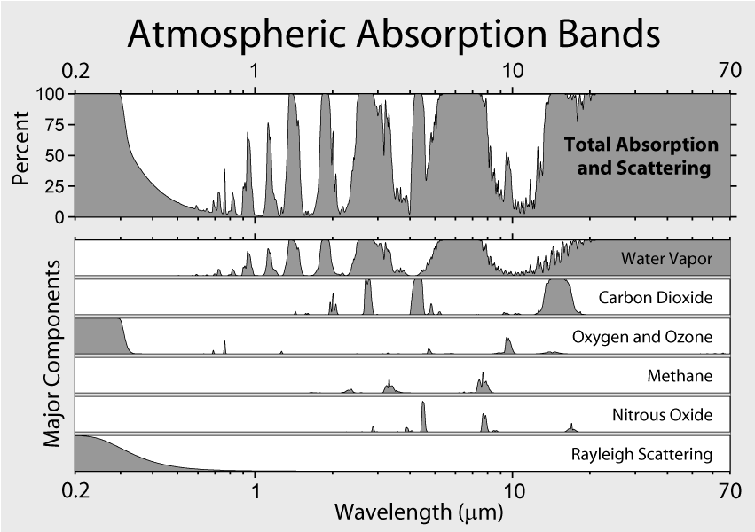
I am always fond of Faithers promoting CO2 as the major culprit in heat retention, when methane is far more active in that category. Why not discuss that? Probably because methane is not a major gas produced by human activity? Amazing how a La Nina can cool things despite the CO2 levels. Moving the goal posts and manipulating data is not the stuff of science sorry.

For starters, climatologists are warning us about methane. In fact, one of the most severely feared positive feedback loops from rising CO2 concentrations is the fact that melting permafrost will release a massive amount of methane. And considering that Methane is so much more potent than CO2, this could have the impact of super charging the global warming effect.

But to your point, there is another reason that CO2 is the primary culprit (beyond the fact that we produce much larger amounts of CO2 than methane) and that is the fact that CO2 takes so much longer to normalize through natural processes. Whereas methane might last for 50-100 years in the atmosphere, CO2 can have an impact for 500 years.
 
NASA has doubled 1880 to 1980 sea level rise since Hansen 1983. In 1983, NASA showed very little sea level rise after 1950. Now they show rapid sea level rise from 1950 to 1980.

This fraud should not surprise anyone, because they have also doubled global warming via data tampering during that same time period.

NASA – Doubling Sea Level Rise By Data Tampering | Real Science

Newer research, methods, and models result in different measurements. The only reason that you or Mr. Goddard read something nefarious out of the fact that the adjustment was upward is because you were previously convinced of an ulterior motive.

And so the reason you believe, but have no evidence in support of, that they manipulated the data to make the rate of increase faster because....what? It makes the threat of climate change worse to increase the rate of sea level rise by 0.9 mm per year? And therefore...what?

Step 3 is profit I know that much, but what the **** is step 2?

Southpark reference btw
 
Last edited:
....no, it hasn't.

New measurements came out with new results.

Here's the mistake I know you're making: you are under the impression that sea level is something you can readily measure in a singular, objective fashion. You think there's some single, "historic data" that someone has to change.

In reality, sea level is tricky to actually measure. The ocean constantly bulges out due to the moon's gravity, causing tides. The earth and its surface are also not a perfect sphere - there's a bulge at the equator. And until very recently, we had to try and measure the water from various beaches, and how much that changes. But if you measure the change in sea level on the coast of Florida and the change in sea level on the coast of Italy, you don't even come up with the same number each year.

Ocean's wiggly, basically. Tough to measure. These days we're able to measure better with advanced satellites.

So yeah, newer methodologies might come out different. Make sense?

How can you measure 1992 sea levels with today's technology?

What he's basically saying is that in 1992 - 2004 they came out with the average sea level per year on a graph. That cannot be changed for the simple fact that its history. It's in the past. It cannot be re-measured. Yet, according to his graph, the graphs of today do not coincide with the graphs of yesteryear. It would make sense if the amounts on that graph varied from 2005-present. It doesn't make since that those numbers for 1992-2004 would change based on current measurement systems. The whole math system would have to be redone and frankly, math is math. 2+2 will always equal 4 no matter what method is used to come to that answer. So mathematically speaking, the numbers for 1992-2004 should not have changed the way his graph is showing its changed.
 
NASA has doubled 1880 to 1980 sea level rise since Hansen 1983. In 1983, NASA showed very little sea level rise after 1950. Now they show rapid sea level rise from 1950 to 1980.

This fraud should not surprise anyone, because they have also doubled global warming via data tampering during that same time period.

NASA – Doubling Sea Level Rise By Data Tampering | Real Science

Once again the denizens of Denierstan prove that they cannot read. Hansen 1983 cited Gornitz et al. 1982, which found 100-year SLR (1880-1980) of 100 mm ± 50 mm. NASA today cites CSIRO, which in turn cites Church & White 2011, which found 100-year SLR (1880-1980) of 140 mm ± 30.
:: Sea-level Rise :: CSIRO ::

In other words, (a) overlapping error bars; and (b) science advances.
 
How can you measure 1992 sea levels with today's technology?

What he's basically saying is that in 1992 - 2004 they came out with the average sea level per year on a graph. That cannot be changed for the simple fact that its history. It's in the past. It cannot be re-measured. Yet, according to his graph, the graphs of today do not coincide with the graphs of yesteryear. It would make sense if the amounts on that graph varied from 2005-present. It doesn't make since that those numbers for 1992-2004 would change based on current measurement systems. The whole math system would have to be redone and frankly, math is math. 2+2 will always equal 4 no matter what method is used to come to that answer. So mathematically speaking, the numbers for 1992-2004 should not have changed the way his graph is showing its changed.

They can rewrite history more to their liking though.
 
How can you measure 1992 sea levels with today's technology?

What he's basically saying is that in 1992 - 2004 they came out with the average sea level per year on a graph. That cannot be changed for the simple fact that its history. It's in the past. It cannot be re-measured. Yet, according to his graph, the graphs of today do not coincide with the graphs of yesteryear. It would make sense if the amounts on that graph varied from 2005-present. It doesn't make since that those numbers for 1992-2004 would change based on current measurement systems. The whole math system would have to be redone and frankly, math is math. 2+2 will always equal 4 no matter what method is used to come to that answer. So mathematically speaking, the numbers for 1992-2004 should not have changed the way his graph is showing its changed.

You mistakenly assume that the only possible reason (outside of something nefarious) for the adjustment is in the measuring aspect. And then you analogize it a simple 2 + 2 equation. This is a calculation of global sea rise. The ocean covers 75% of the surface and every point at which the sea touches land is a potential measuring point. That is impossible and requires modeling to attempt to approximate the rise in sea level based on a wide-ranging, but limited, data points. Over time, that modeling and the computer power behind it will change.

You can not analogize measuring global sea rise to a simple math equation.

Also, as Poor Debater points out in post #29 - the OP (and the article he cites) reference two different entities that rely upon two different sources for their reports. It is inaccurate to claim that NASA adjusted any data - they just used a different source for their report.
 
Methane has a GWP of 21, which means it's 21 times more effective at preventing infrared radiation from escaping the planet.

Uh huh, show me.

Here's a diagram of Atmospheric Absorption bands including methane:

zDOdq.png


So tell me why is methane claimed to be 21 times more effective at
preventing infrared radiation from escaping the planet than CO2?
Looks to me like its Number 4 after Ozone and Oxygen.

By the way Scientific American claims CH4 is 72 times more powerful
than CO2 or a few years later 84 times and I know I've seen over
100 times more powerful. You guys seem to make it up as you go
along. Do you need links for all of that?

Look, you asked me a question and I supplied the answer. Point is methane is a better heat retainer than CO2. The article explained why. The incredibly small percentage changes in CO2 levels that the Faithers claim are sending us into global flooding would be much worse if that same percentage was methane. It would be fairly easy for volcanoes to vent that much methane by the way. Volcanoes which have absolutely nothing to do with people running around the planet.
 
For starters, climatologists are warning us about methane. In fact, one of the most severely feared positive feedback loops from rising CO2 concentrations is the fact that melting permafrost will release a massive amount of methane. And considering that Methane is so much more potent than CO2, this could have the impact of super charging the global warming effect.

But to your point, there is another reason that CO2 is the primary culprit (beyond the fact that we produce much larger amounts of CO2 than methane) and that is the fact that CO2 takes so much longer to normalize through natural processes. Whereas methane might last for 50-100 years in the atmosphere, CO2 can have an impact for 500 years.

Your time lines are wrong, but yes CO2 is retained longer. A methane release from melting Artic ice is not settled science at all. It also could be collected and used versus just letting it be released to the atmosphere. The Doomsday mentality gets boring to be honest.
 
Your time lines are wrong, but yes CO2 is retained longer. A methane release from melting Artic ice is not settled science at all. It also could be collected and used versus just letting it be released to the atmosphere. The Doomsday mentality gets boring to be honest.

How are you going to collect the methane from melting permafrost? We are talking about millions of acres in some of the most in hospital areas of the world.

As for the timelines, you are partially correct in saying that I was wrong. Methane lasts 12 years, but CO2 does have a warming scale of anywhere from 500 - 1000 years. And either way, the fact that CO2 does have such a lasting impact on the climate does warrant additional scrutiny when compared to methane.
 
Look, you asked me a question and I supplied the answer. Point is methane is a better heat retainer than CO2. The article explained why. The incredibly small percentage changes in CO2 levels that the Faithers claim are sending us into global flooding would be much worse if that same percentage was methane. It would be fairly easy for volcanoes to vent that much methane by the way. Volcanoes which have absolutely nothing to do with people running around the planet.

And if the Volcanoes suddenly start producing massive amounts of methane, then we can all become very worried about Volcanic activity. However, Volcanoes are not currently producing some extraordinary amount of methane or any other greenhouse gas, and their activity was not inordinately high in the recent past.

Volcanoes are not to blame for the current warming. Humans are.
 
How are you going to collect the methane from melting permafrost? We are talking about millions of acres in some of the most in hospital areas of the world.

As for the timelines, you are partially correct in saying that I was wrong. Methane lasts 12 years, but CO2 does have a warming scale of anywhere from 500 - 1000 years. And either way, the fact that CO2 does have such a lasting impact on the climate does warrant additional scrutiny when compared to methane.
Please quote out from your citation 2.10 Global Warming Potentials and Other Metrics for Comparing Different Emissions - AR4 WGI Chapter 2: Changes in Atmospheric Constituents and in Radiative Forcing
where it says CO2 persists in the atmosphere for 500 to 1000 years?
 
You mistakenly assume that the only possible reason (outside of something nefarious) for the adjustment is in the measuring aspect. And then you analogize it a simple 2 + 2 equation. This is a calculation of global sea rise. The ocean covers 75% of the surface and every point at which the sea touches land is a potential measuring point. That is impossible and requires modeling to attempt to approximate the rise in sea level based on a wide-ranging, but limited, data points. Over time, that modeling and the computer power behind it will change.

You can not analogize measuring global sea rise to a simple math equation.

Also, as Poor Debater points out in post #29 - the OP (and the article he cites) reference two different entities that rely upon two different sources for their reports. It is inaccurate to claim that NASA adjusted any data - they just used a different source for their report.

As you state, its based on limited data points. Those data points measure depth when placed in the ocean (which some are) and others measure rise when placed on land. While the depth/rise are constantly changing, as is the measurements in reflection of that, those measurements never change once they are taken. Scientists then average that measurement in order to show it in graph form. If scientist A uses the highest points in those measurements and scientist B uses the lowest point in those measurements then naturally they are going to come up with differing measurements. However if they use those same measurements over time and compare them to each other the rise of the sea level will remain consistent no matter what points you use. In other words scientist A over time shows that the average sea rise of ±5mm while using the highest point measurments. Scientist B should be the same showing ±5mm rise using the lowest point measurements. The math stays the same. 2+2=4.

Where the data can be manipulated is when you first use certain points of data vs where you are presently using the data points. In other words scientist B makes the first measurement at the lowest point of the recorded measurements for a graph and then later on uses the highest data point measurements for a graph while still using the data points that they first used for part of the graph. At that point you are no longer using a steady measurement but instead are using varied measurements. This will change how the graph looks vs how it would look if you used the same measurement points.

Here's some simplified math to show what I'm talking about.

Steady measurements:
Scientist A measuring high points: 9+9=18: over time: 9+10=19 which makes a difference of 1 point.
Scientist B measuring low points: 2+2=4: over time 2+3=5 which makes a difference of 1 point.

Both totals showing an average of 1 point when compared.

Varied measurements:
Scientist A first measurement using high points: 9+9=18: over time using low points but keeping the first averaged measurement as a baseline: 9+6=15 which makes a difference of 3 points.
Scientist B measuring low points: 2+2=4: over time 2+3=5 which makes a difference of 1 point.

When comparing both totals there is a difference of 2 points.

In both situations the math is correct. But one set is manipulated to show a certain outcome while the other is not.
 
Last edited:
331k5ya.jpg


If you plot out the data 1992 - 2004 as it was published in 2004 you will get the blue line on the graph.

If you plot out the data 1992 - 2004 as it is published today, you will get the red line on the graph.

The two plots are different. The historical data has been re-written.

So, the blue line is a projection and the red line is the reality.
 
So, the blue line is a projection and the red line is the reality.
The way I understand it, the blue line was the official number as it was published in 2004,
the red line is the official number as published today.
 
The way I understand it, the blue line was the official number as it was published in 2004,
the red line is the official number as published today.

The blue line was a published prediction in 2004 and the red line is the published reality today.

That's what it looks like. So it seems that the only manipulation is coming from that denier who wrote the article.
 
The blue line was a published prediction in 2004 and the red line is the published reality today.

That's what it looks like. So it seems that the only manipulation is coming from that denier who wrote the article.
Both end in 2004, so in 2004 it was not a prediction.
 
Global sea levels are fairly meaningless, because sea level is mostly a local concern.
If your local sea level is rising quickly, it is a concern.
For most of the places on earth where the sea level is rising, the rate appears to be
unchanged back to the 1800's.
I thought it would be interesting to see what the NOAA global sea level trend average was.
Sea Level Trends - MSL global stations trends table
I loaded the global trend table into excel and averaged all 232 stations.
The average sea level rise for all of NOAA's stations was....1.008 mm/year.
This is because there are quite a few stations where the sea level is falling.
The bottom line with sea level, is that most of the acceleration shown, is because of the
switch from shore based tide stations to satellite numbers, and the satellites
lack the necessary accuracy to show the changes recorded.
 
How can you measure 1992 sea levels with today's technology?

What he's basically saying is that in 1992 - 2004 they came out with the average sea level per year on a graph. That cannot be changed for the simple fact that its history. It's in the past. It cannot be re-measured. Yet, according to his graph, the graphs of today do not coincide with the graphs of yesteryear. It would make sense if the amounts on that graph varied from 2005-present. It doesn't make since that those numbers for 1992-2004 would change based on current measurement systems. The whole math system would have to be redone and frankly, math is math. 2+2 will always equal 4 no matter what method is used to come to that answer. So mathematically speaking, the numbers for 1992-2004 should not have changed the way his graph is showing its changed.

The first example I can think of is recalibrating tidal gauges based on newer satellite data, and then readjusting past tidal gauge data based on that.

The alternative is, what, exactly? The same research group just changed all their numbers 10 years later, published both sets of data, and hoped nobody would notice? You'd think people intent on deception wouldn't, you know, publish their deception.

OPs source cited two studies of sea level change. Later in the thread another poster presented two more studies of sea level change.

How many of these four studies did you read?
They absolutely should not have re calibrated any tide gauges to satellite data,
as the satellites are about 20 time less accurate than the mechanical tide gauges from a century ago.
 
So, the blue line is a projection and the red line is the reality.

No, the blue line is what the data said in 2004. The red line is what the data says today.
Sort of like by the end of the book it said, "All animals are equal but some are more equal
than others." Orwell understood that the people who write history can change history,
and Winston Smith seems to be busy at Colorado University these days.
 
They absolutely should not have re calibrated any tide gauges to satellite data,
as the satellites are about 20 time less accurate than the mechanical tide gauges from a century ago.

If only there were some way of knowing what they did. Like, if they'd published their methodology in a research paper so we could see why there's a difference. Rather than, you know, assuming ****.
 
No, the blue line is what the data said in 2004. The red line is what the data says today.
Sort of like by the end of the book it said, "All animals are equal but some are more equal
than others." Orwell understood that the people who write history can change history,
and Winston Smith seems to be busy at Colorado University these days.

As methodology updates, past data can be updated to reflect it. The fact that the estimates are different now is not proof of fraud.
 
No, the blue line is what the data said in 2004. The red line is what the data says today.
Sort of like by the end of the book it said, "All animals are equal but some are more equal
than others." Orwell understood that the people who write history can change history,
and Winston Smith seems to be busy at Colorado University these days.

I dunno, there's something funny about this story. Something's not adding up, and it ain't NASA or UC.
 
If only there were some way of knowing what they did. Like, if they'd published their methodology in a research paper so we could see why there's a difference. Rather than, you know, assuming ****.
Gee, You were the one who stated,
The first example I can think of is recalibrating tidal gauges based on newer satellite data, and then readjusting past tidal gauge data based on that.
I was commenting on what you said, did you assume that, or read it somewhere?
 
I dunno, there's something funny about this story. Something's not adding up, and it ain't NASA or UC.

Here are links to the two data sets:

#version_2004_rel1.2

#version_2014_rel3

The wayback machine doesn't have 2014 release 2 so release 3 will have to do.
And CU's web site is still down today.

Doesn't matter though, if you download into your Excel spreadsheet and use
Excel's slope function it's rather easy to duplicate that graph and come to the
conclusion that the data has been changed. Why it's been changed is a matter
of opinion but that it has been changed is a matter of fact.
 
Back
Top Bottom